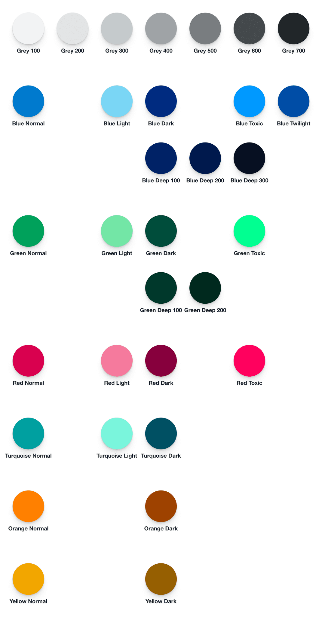
Colors algorithmization
Exploring color palette generation algorithms
I was curious about the algorithmization of creating a color palette. So, instead of relying solemnly on my eyes, I tried to use a logical approach.
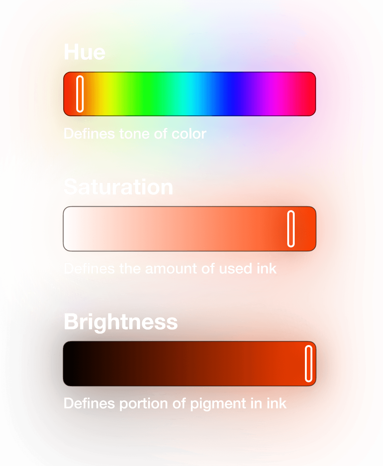
Choosing a color space
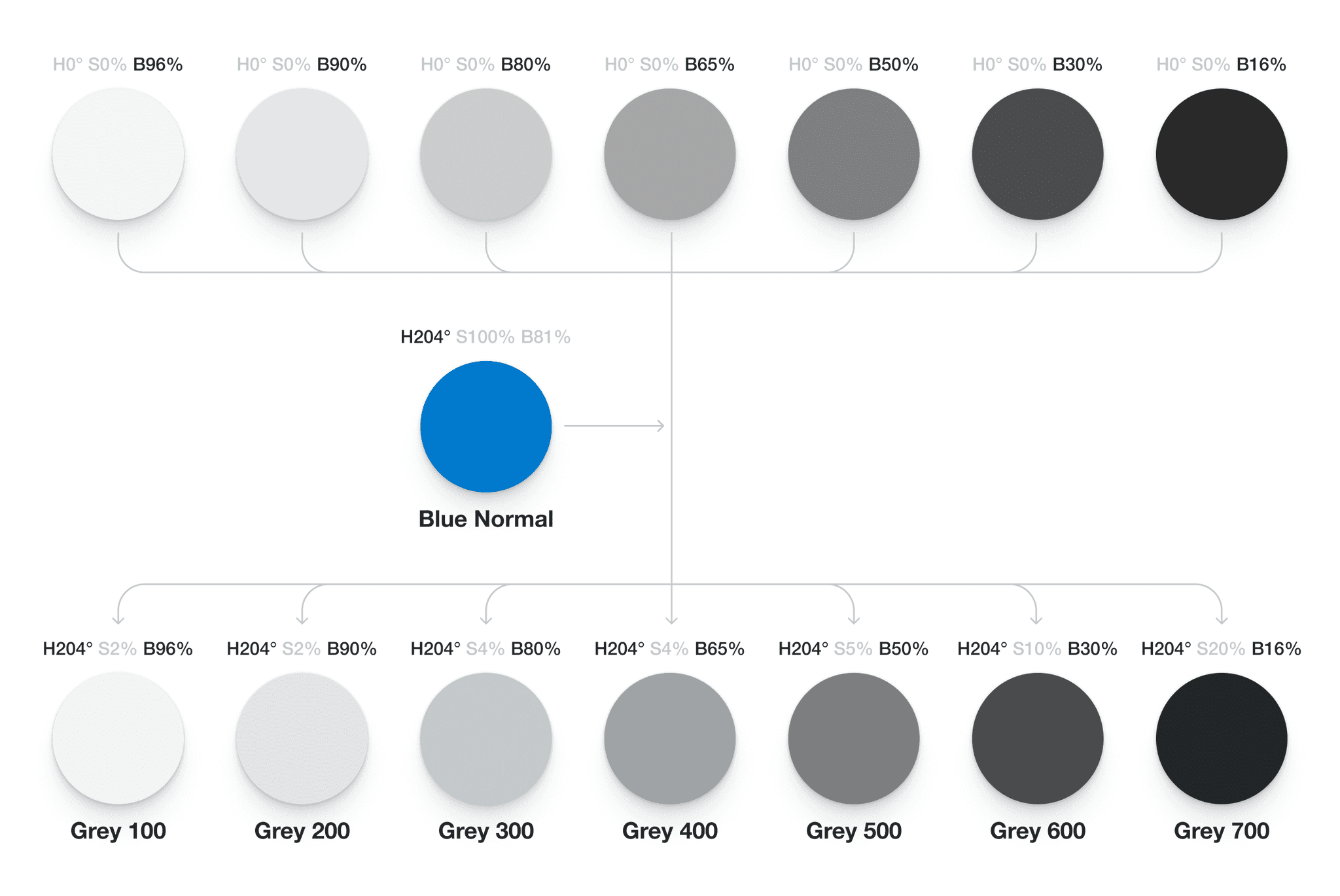
Making an achromatic palette
Our color perception is non-linear, so changing the portion of black (brightness) at the same value won’t work.

Instead, I slowly reduced the portion of black (brightness) and marked a new color as soon as the difference from the previous one was visible enough.
This approach has a splendid side effect: it reduced the number of colors in a palette by eliminating those that are too similar (i.e., would get in the way anyway).

Another trick was to add a little bit of your primary color (Blue Normal in this case). The addition is almost invisible, but it changes the perception of the interface. Because pure achromatic colors don’t exist in nature, and a drop of color helps them look more natural.
Making a chromatic palette
The logical set of colors was simple: the primary color, green and red (to highlight positive and negative), and a few subsidiary colors. The question was how to create different variations of the same color.
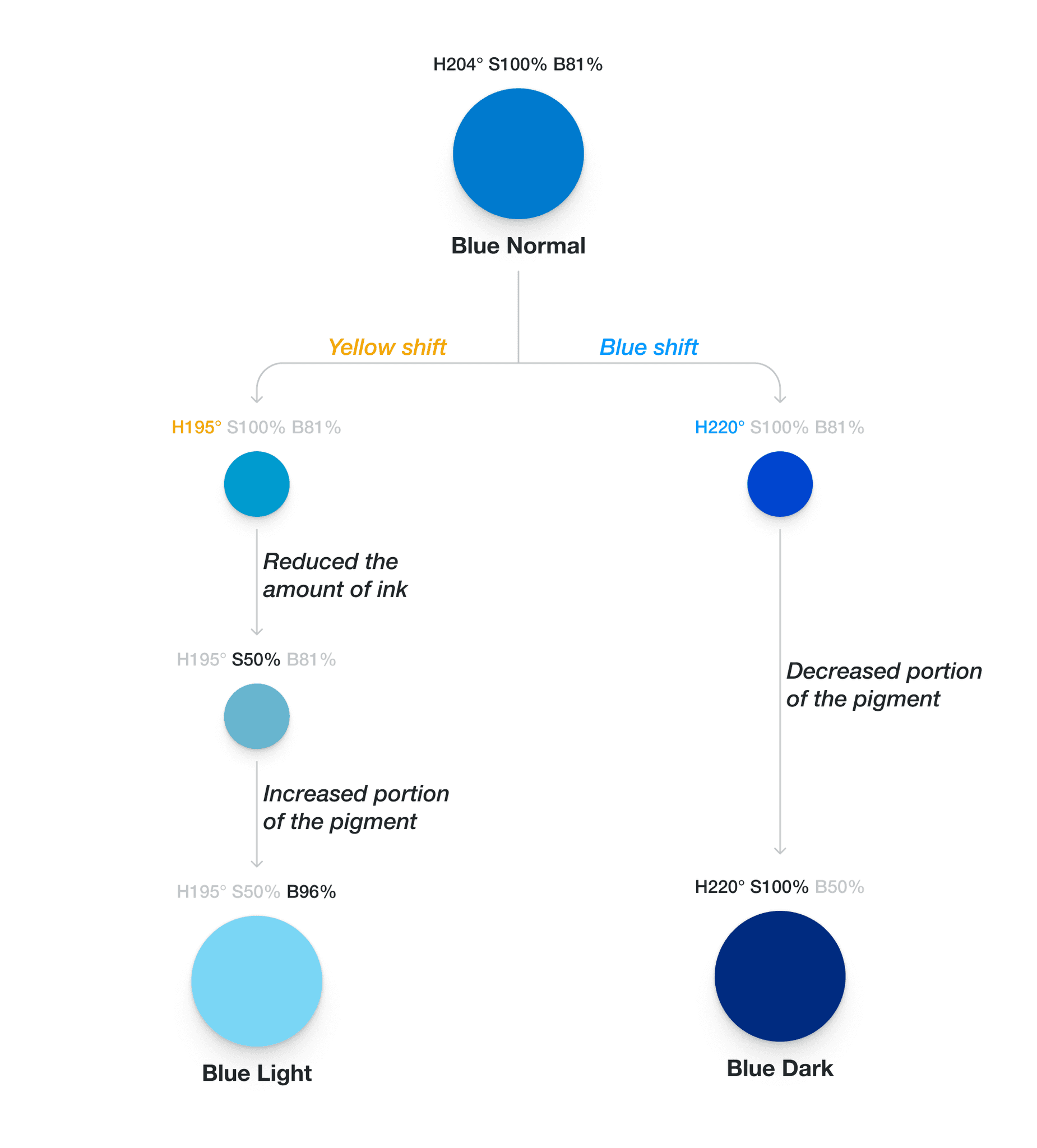
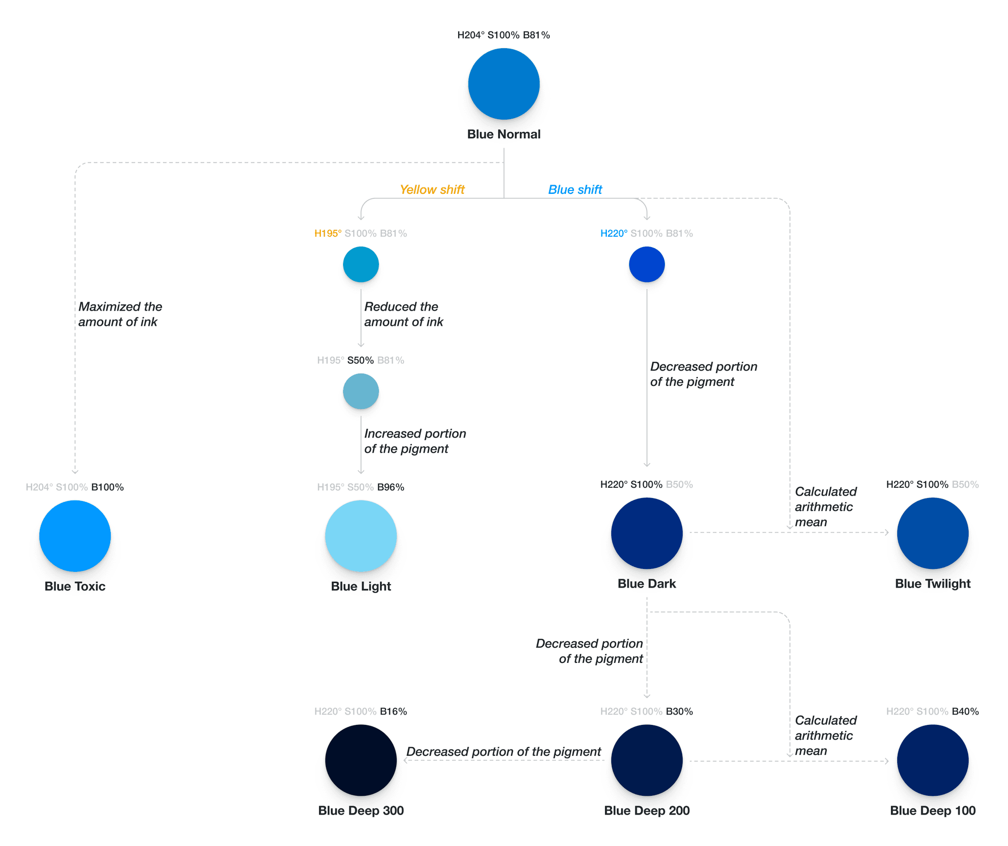
For the primary color, I used another natural light property: the color of lightened surfaces shifts to yellow, and the color of shadowed surfaces shifts to blue:
Step 1. Shift Hue until the difference is significant (like for the achromatic palette)
Step 2. Reduce the amount of ink (saturation) for the light variant to make it less prominent.
Step 3. Reduce/increase the portion of black (brightness) so the difference from the initial color will be the same as the achromatic palette step.
Getting other shades was simple: through marginal values and calculated averages.
Findings
Color space is non-linear and asymmetric. So, it’s hard to define a strict and straightforward algorithm for color selection. Finding colors combines observations of natural light behavior, mathematics, and understanding how the color palette will work.
