Building unique maps
Map styles exploration for product and marketing use
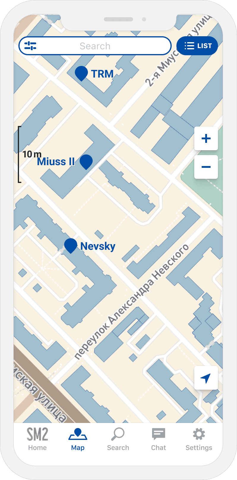
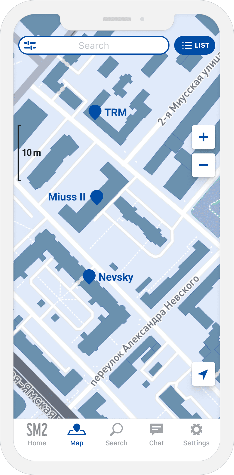
A map was the main screen and the core function of the SM2 application, so I had to ensure it was easily usable and highly attractive.
Finding the perfect tool
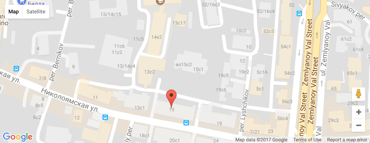
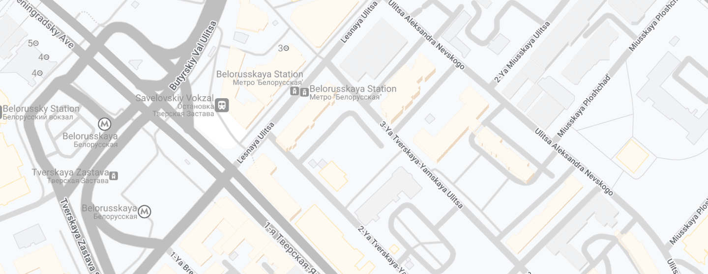
The default Google Maps wasn't a good option because it was too noisy, focused on the wrong objects, and had a style that didn't fit the app design.
I tried to customize Google Maps, but its customization tool provided minimal customization possibilities. The result looked terrible: buildings looked differently for no reason, the barely visible 3D effect made the map harder to read, many colors couldn't be changed, etc.
While searching for alternatives, I found Mapbox with Open Street Maps under the hood. I researched to ensure the OSM data was good enough and successfully presented the new solution to the team.
Styles exploration
SM2 map functionality was different from any navigation app. I couldn't copy a map style of any popular app and had to create a unique one.
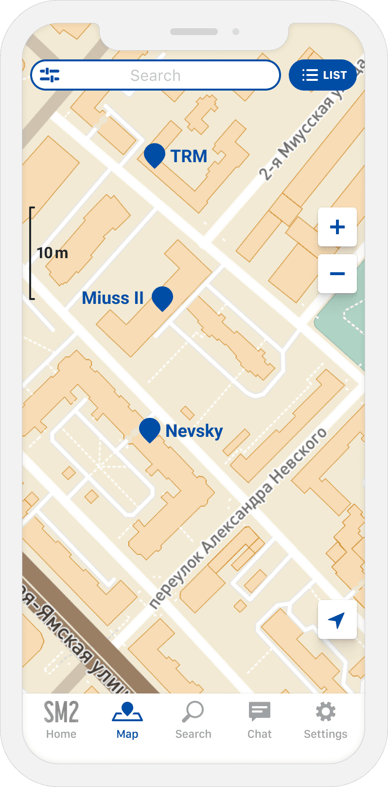
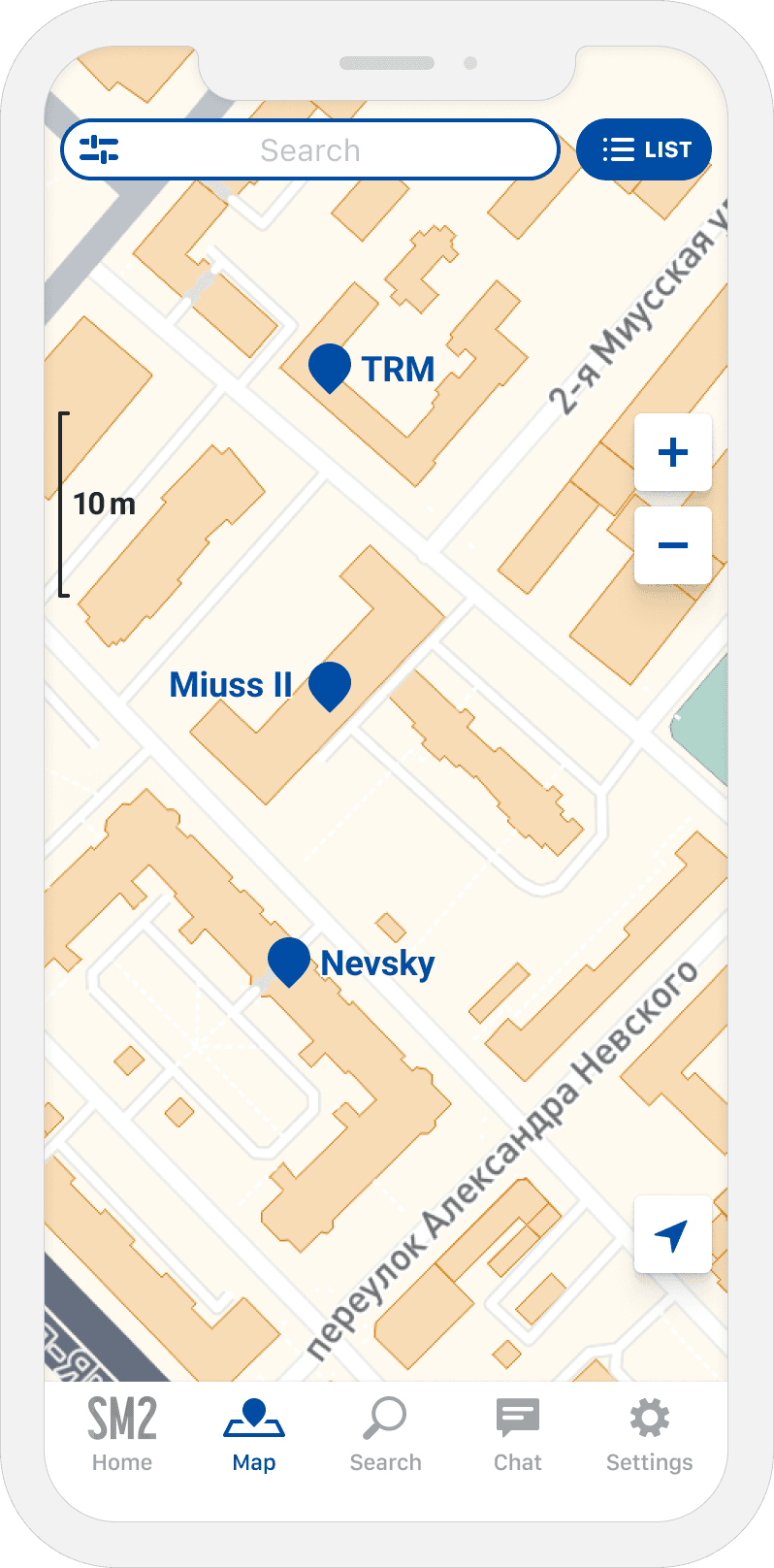
My idea was to focus on buildings (because the app is about them) and primary roads (as an easily recognizable location anchor).
I started with schematic representations of a map.

After finding a few promising schemes, experiments with real maps started. This stage was much more exciting and challenging because:
Every map is a set of maps. Different scale ranges use slightly different sub-maps (some objects look different on various scales; they could even be invisible)
Every sub-map contained 158 layers. I hid many of them to minimize visual noise (some labels, minor roads, admin boundaries, etc.) But there were still a lot of them
To improve the map's readability, I added custom-made pins for the metro and light railway stations
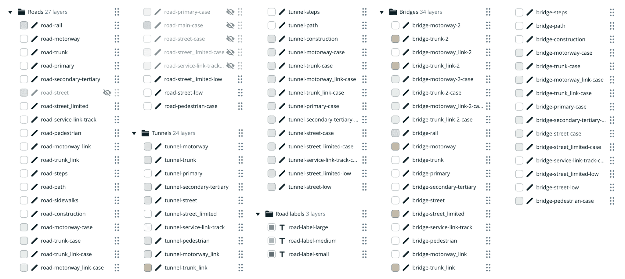
To optimize the amount of work, I experimented only with the primary zoom level.
After spending significant time on research, I couldn't find the map style I liked. Nevertheless, I chose one because there were many other tasks, and engineers needed some version of the map. Anyway, it was already better than Google Maps.
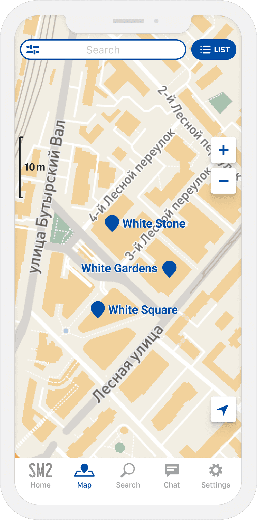
There were a few problems with this variant:
Accent on buildings made the map look busy
Buildings' pins competed with buildings' silhouettes (it was impossible to highlight a building silhouette, so I had to use pins)
The map style didn't fit the app style
Despite my previous attempts, I couldn't find a suitable solution, which made me realize that I had done something wrong.
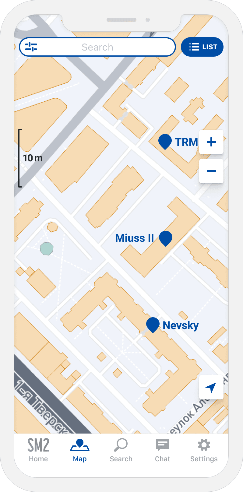
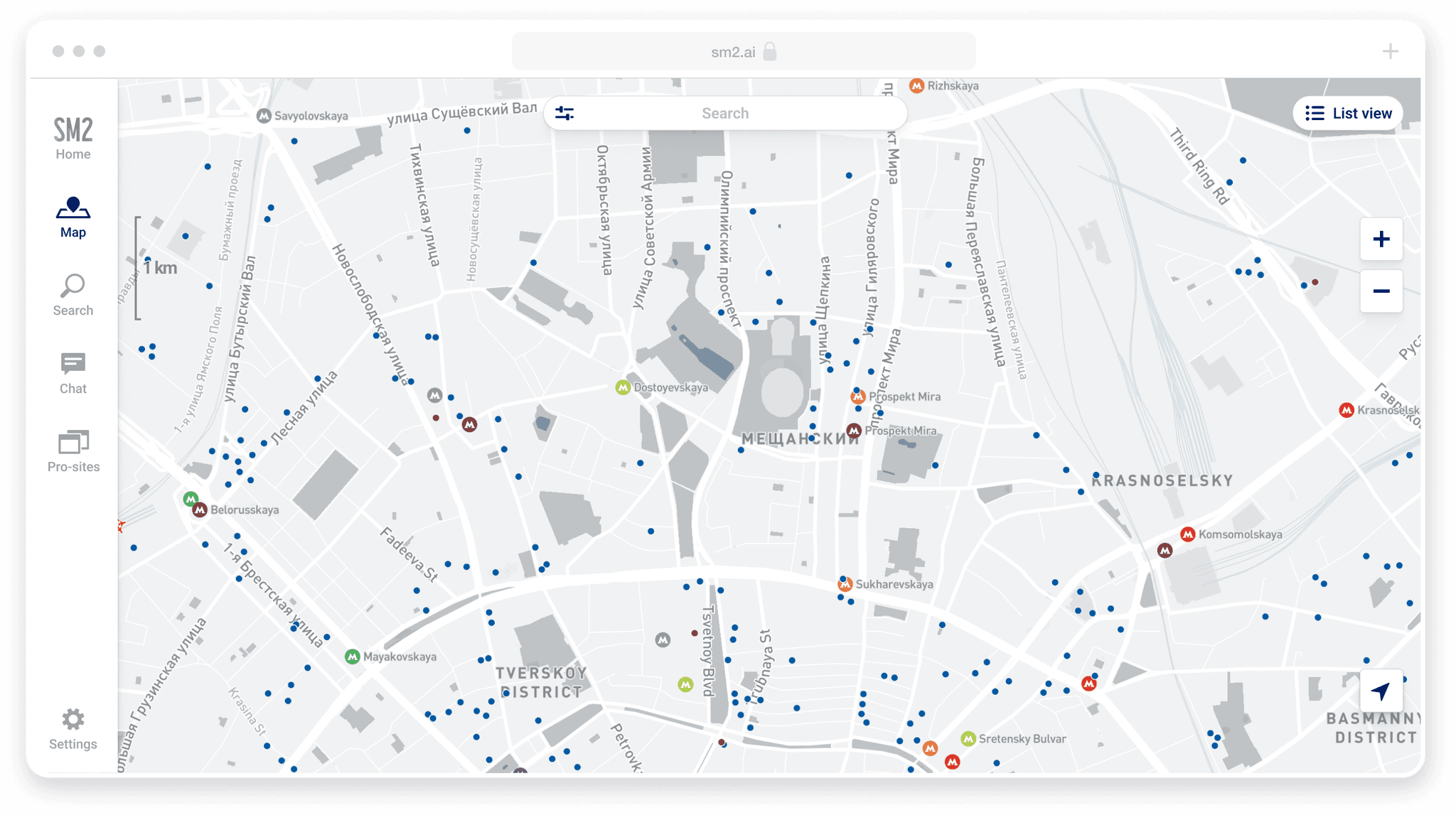
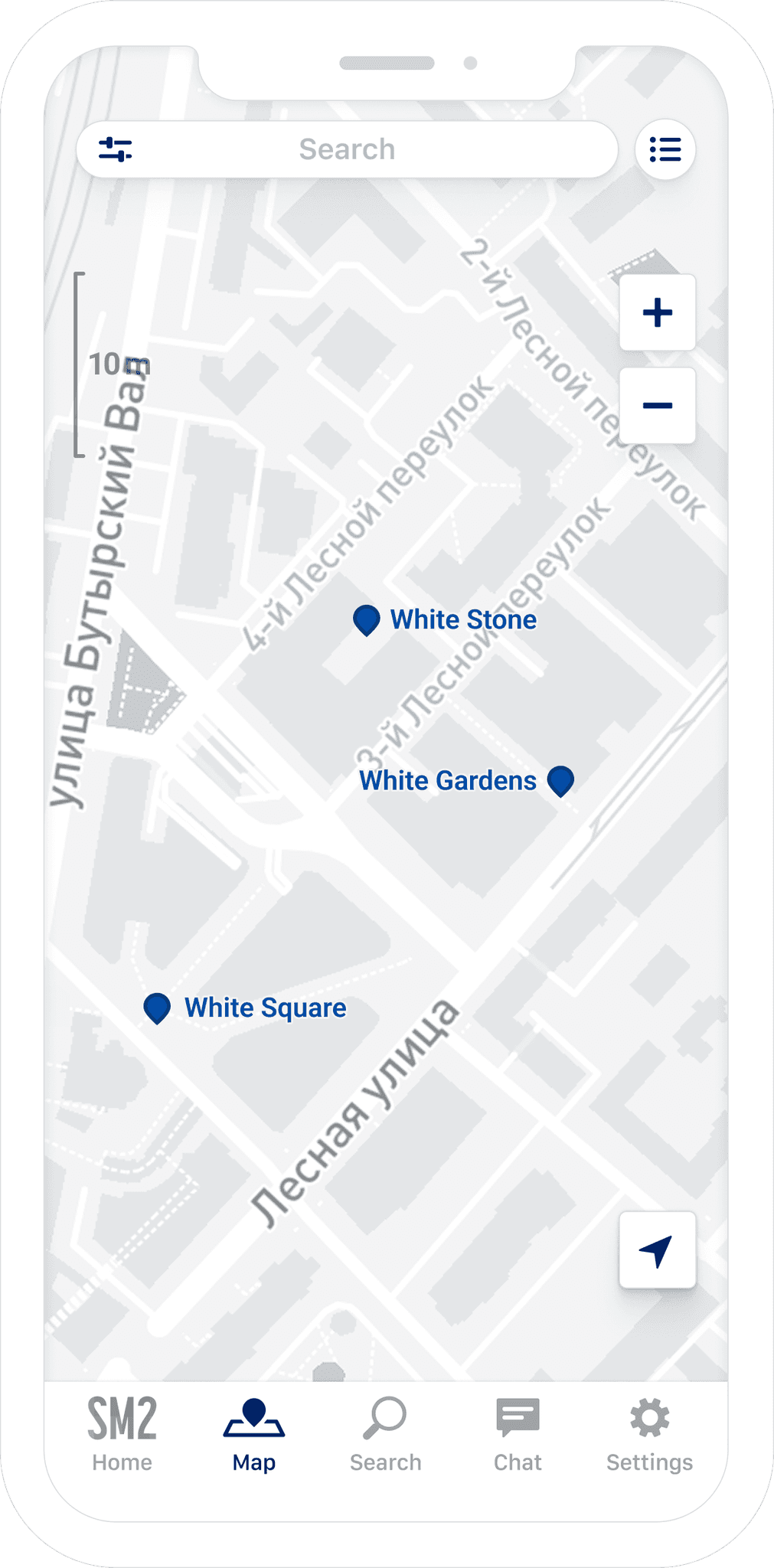
I understood that the initial idea was incorrect: there was no need to highlight buildings because if you do, the map will always look busy. On the contrary, buildings' silhouettes could be almost invisible; there would be pins anyway. Meanwhile, subway stations would be much better location anchors.
Reflections
Despite their seeming simplicity, working with maps was time-consuming. Our map contained 161 layers that had to be managed. Some layers change their appearance during scale changes, so this system had to look consistent with seamless scale transitions. And it must be updated regularly because every map is a living structure that reflects city changes.
Despite all these troubles, having your own map pays off: it looks fantastic in a product and could be used in countless marketing materials.
Custom map bonus
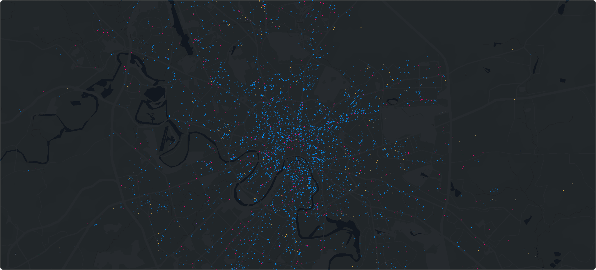
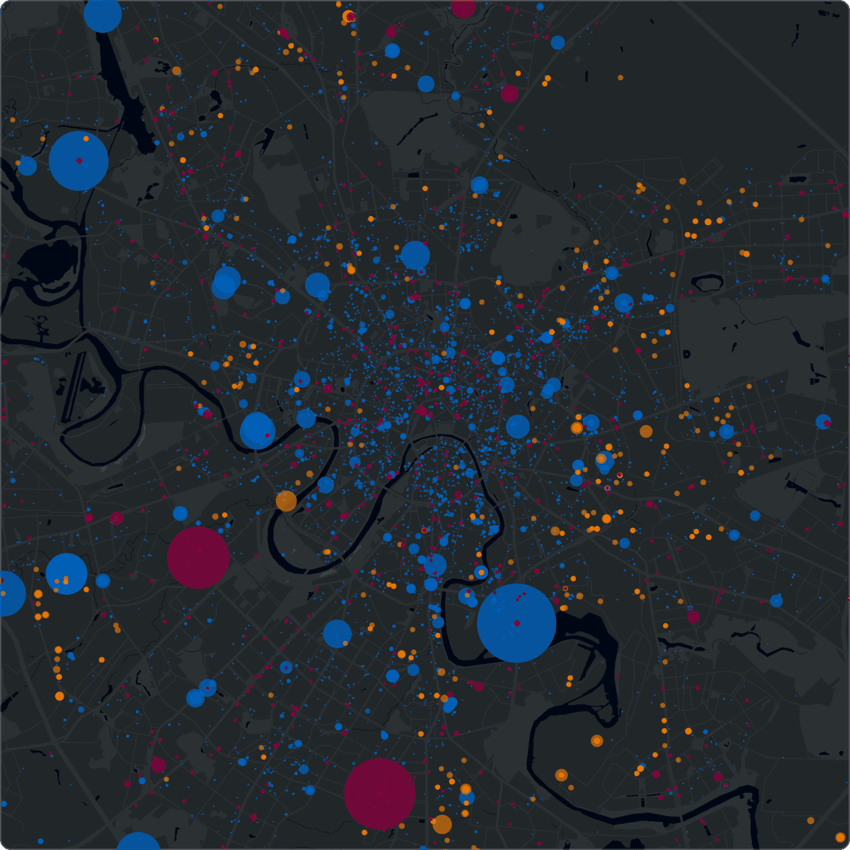
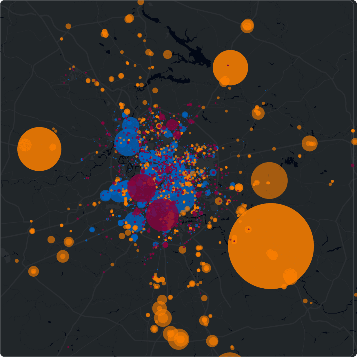
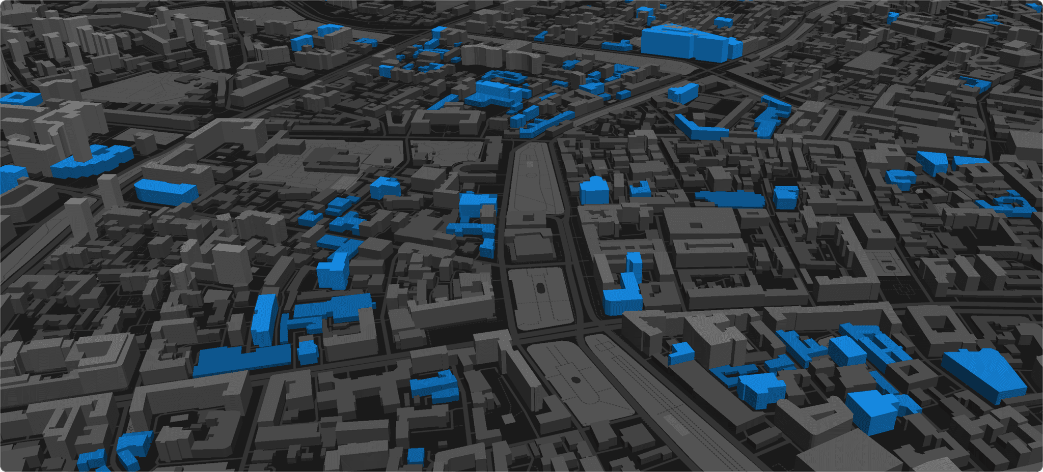
In addition to the main map, I experimented with data visualization.
All the engineers were busy, so I prepared all the data for visualization by myself. The results were quite good and were used everywhere, from ads to investor pitch decks.
