Unorthodox product ideas
I implemented during my work at Everytale
Adaptive registration
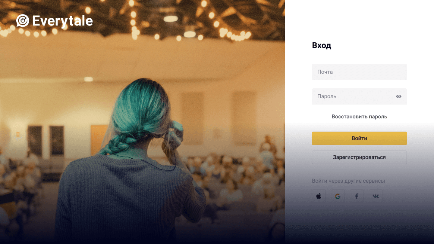
The first version of the registration was a standalone page. While it was large enough to fit all necessary controls, we've received feedback that jumping to a separate page frustrates our users and causes them to lose context.
Another problem was multiple registration entry points. Because part of the system was public, people registered in various user flows. All these cases were processed with the same screen.
Some people also confused the "Log In" and "Sign Up" buttons.
The solution consisted of three principles:
Registration should be in a modal (so users' context doesn't change)
There should be multiple versions of registration reflecting different user flows (so people always have the best explanation of why they need to register)
Use the word "Register" instead of "Sign Up" (so even the appearance of the word is different than "Log In")
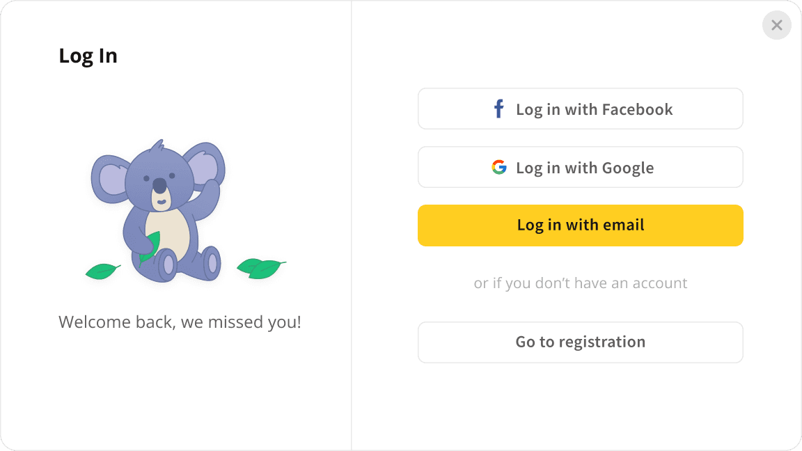
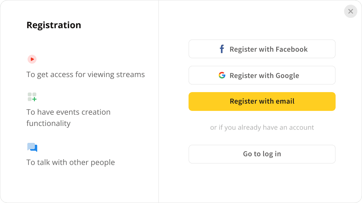
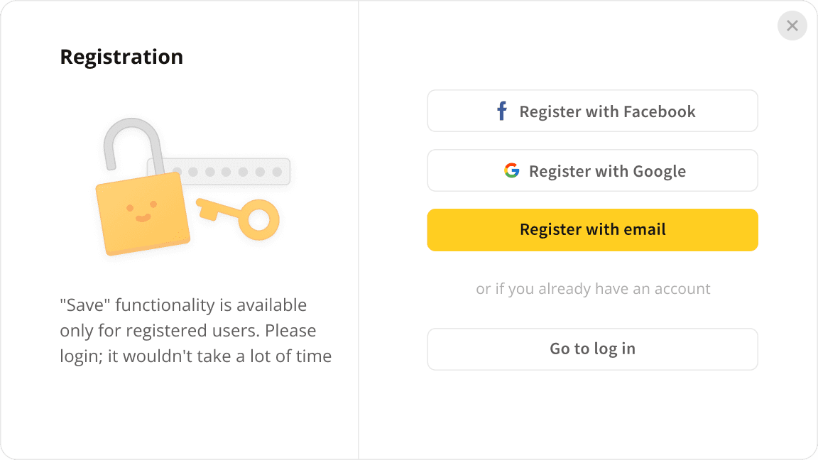
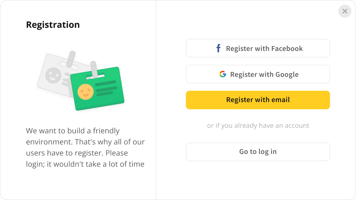
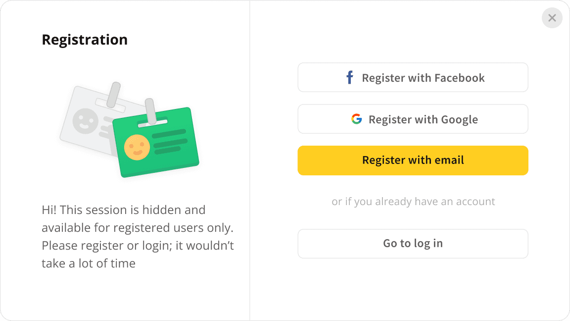
User interviews indicated that the problem completely disappeared for users.
Light / Dark themes, as the system states differentiator
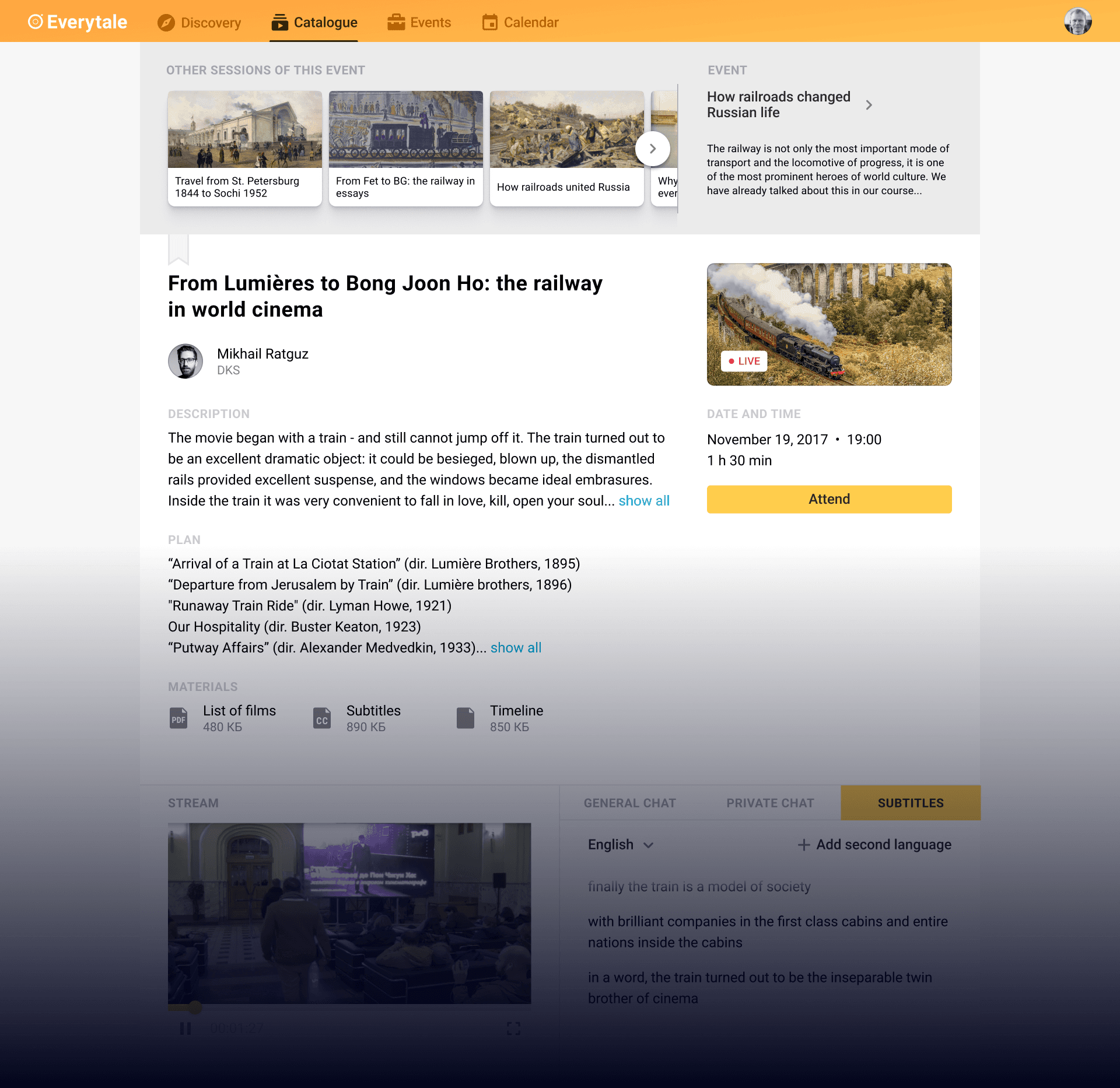
At the start, everything about streams was placed on a single page. It was fine for technical testing but wasn't viable. The page was overcrowded, even with minimal functionality, and didn't allow us to add more in the future.
I needed to split the page into pieces, and I had an extra idea: make two states of the system completely different.
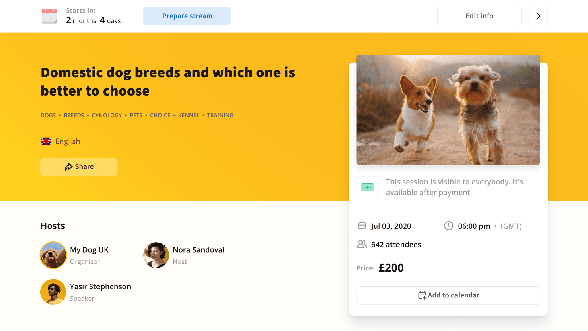
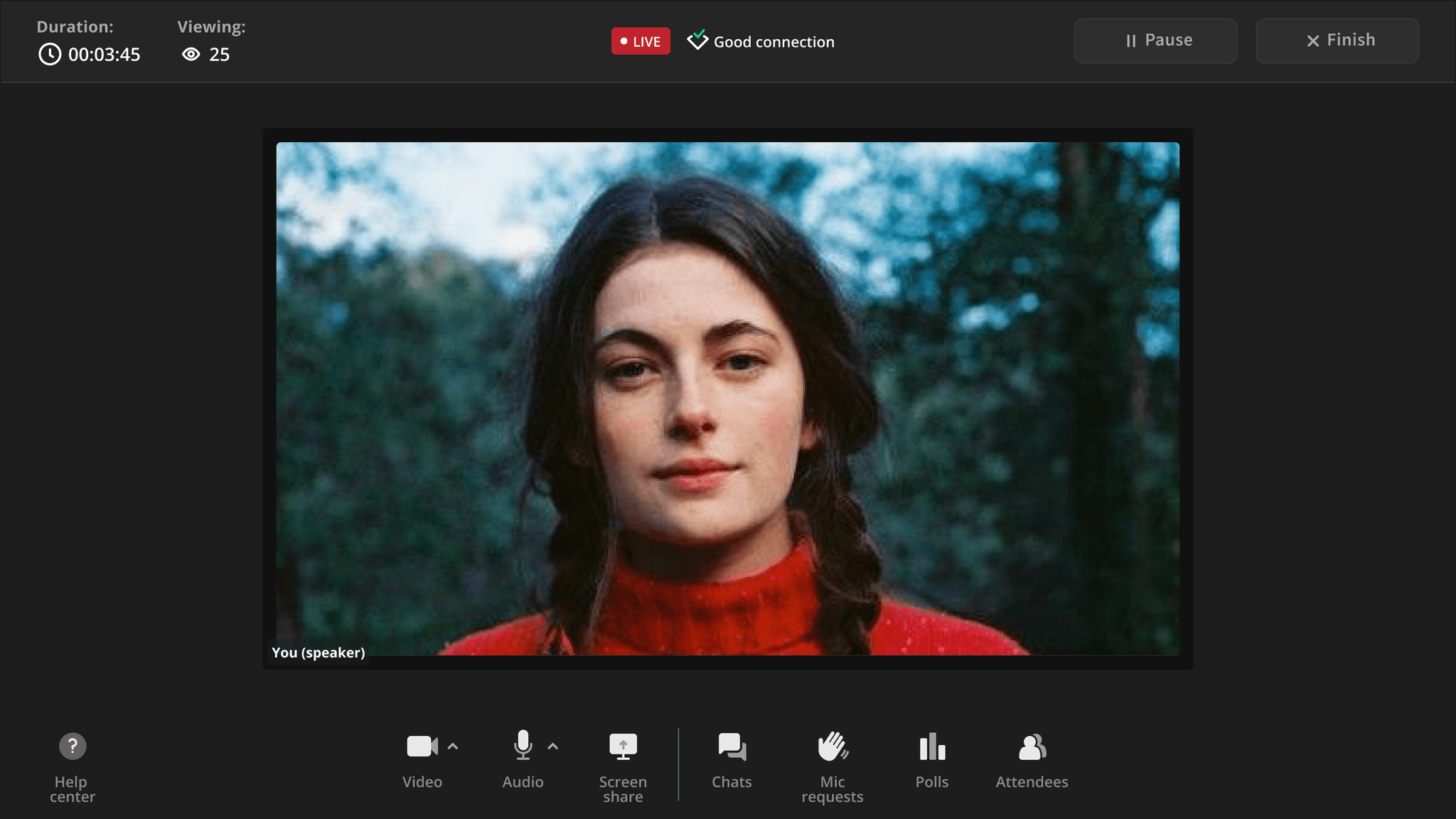
The beauty of this solution was in multiple benefits:
I used the advantages of both themes
The light theme is much more flexible and doesn't restrict designers. Which was especially useful for the potential page customization
The dark themes allow people to focus on the video, create a cozy atmosphere
Two theme components almost didn't intersect because the functionality was utterly different, so extra work was minimized
One ticket to solve many problems

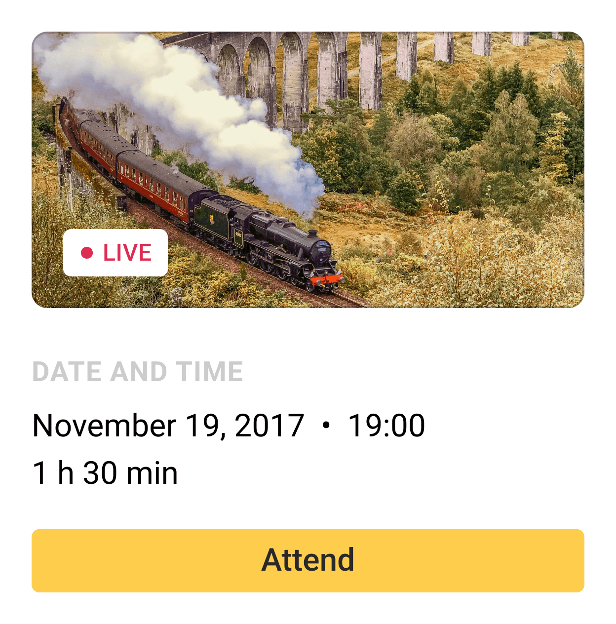
Every streamed event had its page with a compact summary block. The first version of this block was just a static block on the right side of the page.
There were a few problems:
It contained crucial information, but tests showed that it wasn't too visible
It disappeared when people scrolled the page down
The page layout could have been better, without a lot of space underneath the summary block
While researching better alternatives, I noted the idea of a "ticket" and decided to try it. The solution was so good that it became a signature element of the system.
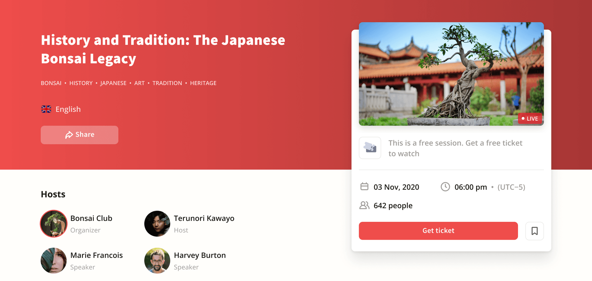
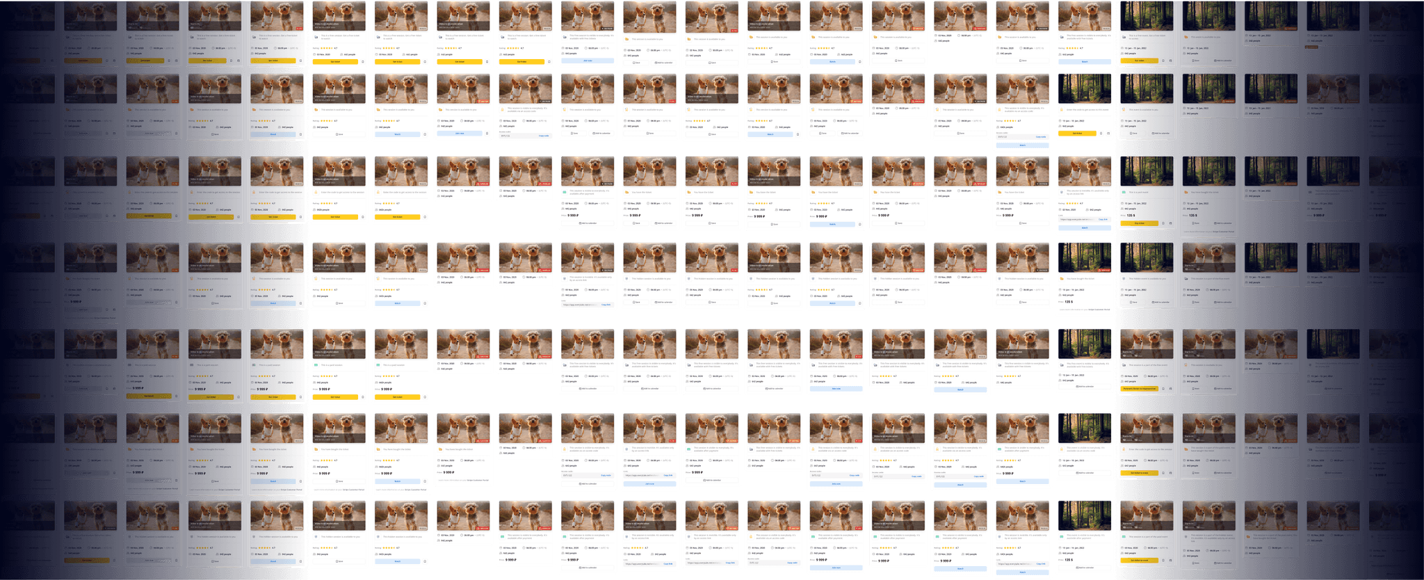
Tickets scrolled with users and were always visible. They were constructed using the module principle and changed depending on a stream's current state, type of event, pricing model, user role, and platform. Ticket modules could be combined in more than 300 combinations.
Quality-improving environment
Initially, a user just needed to press the "Go Live" button to start streaming. After the first users started using the platform, we realized many had hardware or internet connection issues. Moreover, there was no way to check if everything worked without going live. This was an urgent and complicated problem.
My solution was to make a few updates starting from the fastest in implementation.
We first added a connection quality indicator (this easy fix covered 60% of users' issues).

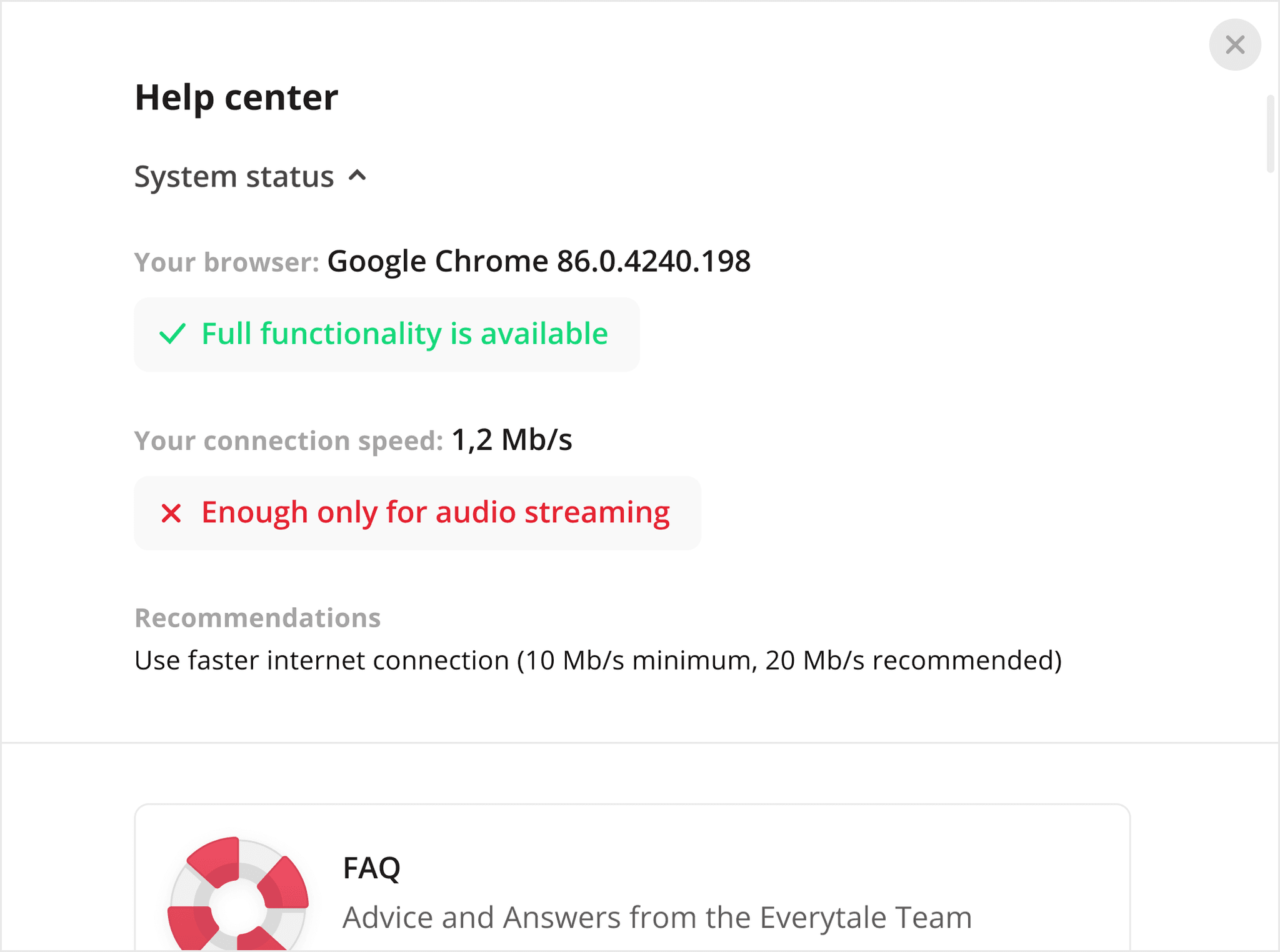
The next step was to show users if their current configuration was suitable for streaming without going live. While we had this modal, we could fix another problem: it checked users' browsers and informed them if some functionality was restricted.
Previous steps helped a lot, but we started to get feedback about hardware problems.
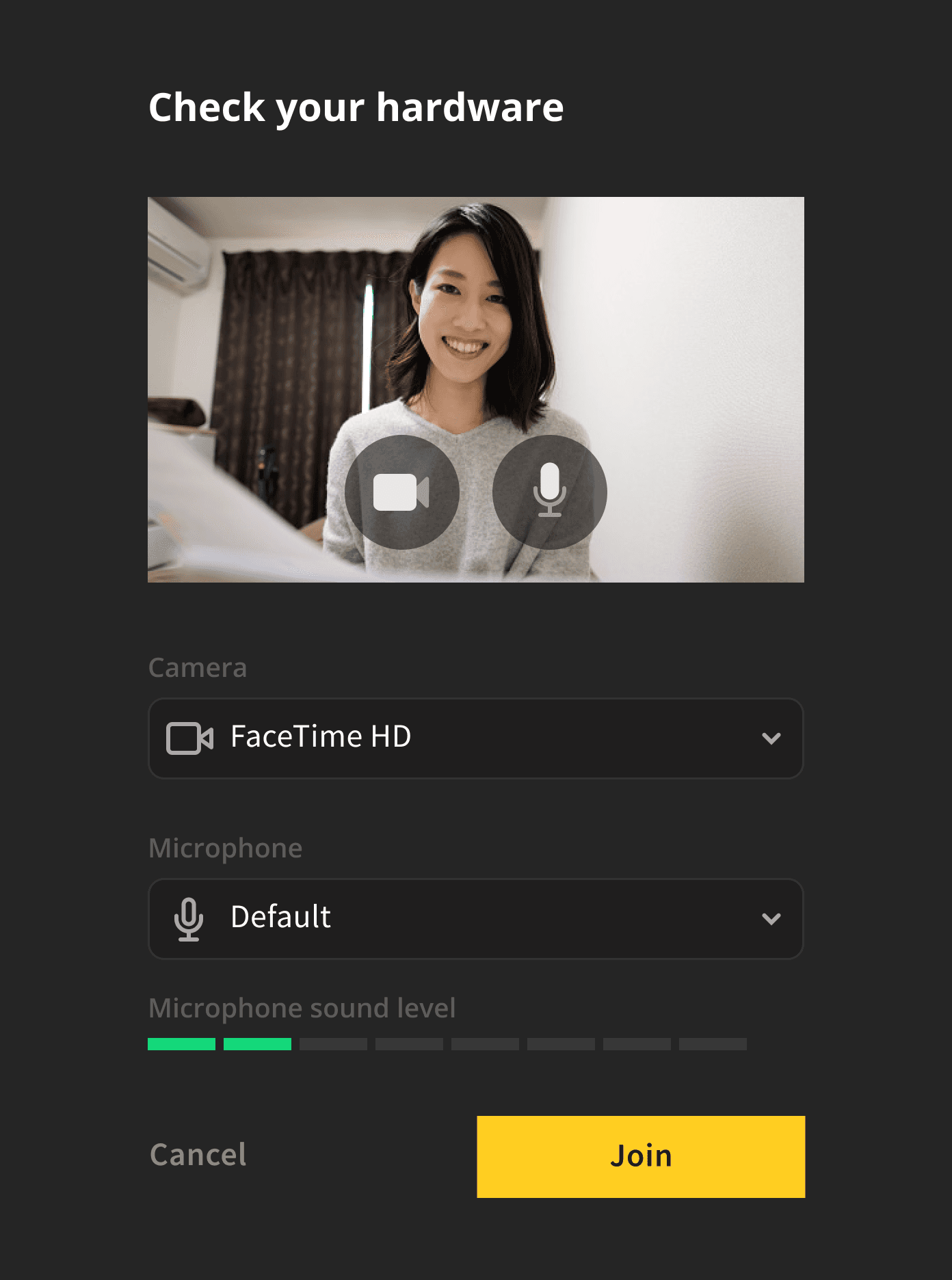
I had an idea that hardware check shouldn't be a standalone feature. It should be integrated into the streaming flow. This way, every streamer would go through it, and nobody would forget about the check. Otherwise, most people would forget to test their hardware (it happened all the time before this feature was implemented).
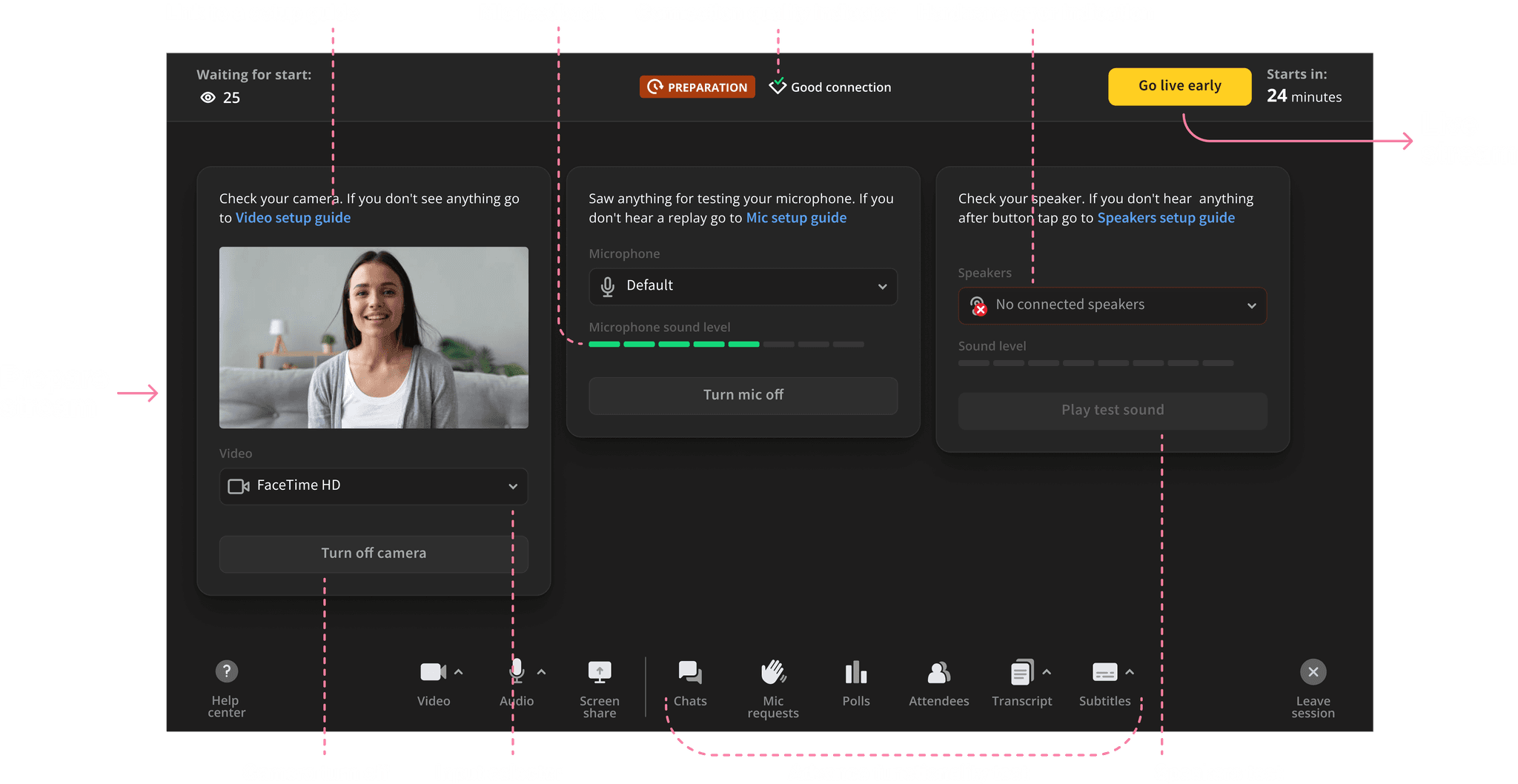
The streaming check had two modifications:
A minimized, fully functional mobile version for hosts
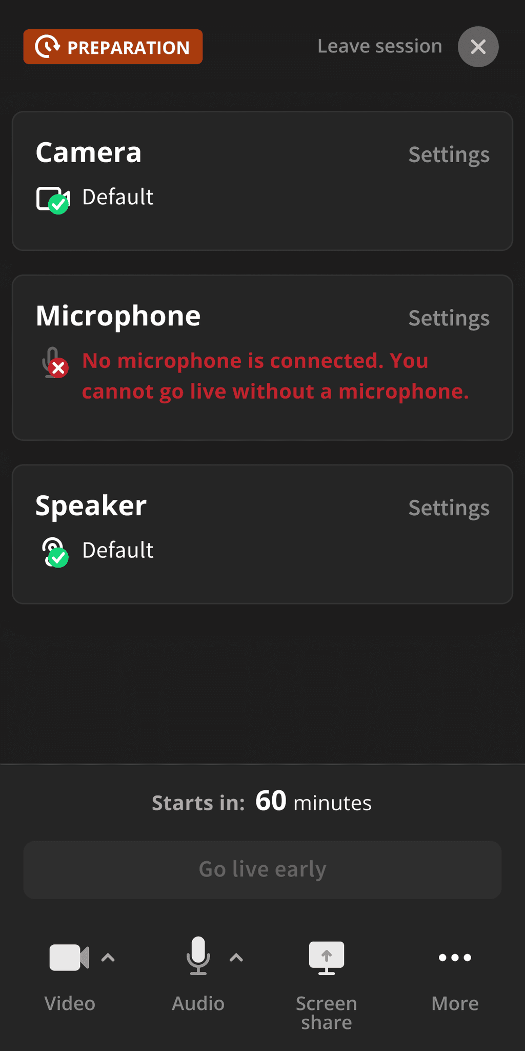
A simplified version for viewers who want to tell something
