From zero to global
Turning raw ideas into an international platform
This is the largest product I’ve built. I joined as the 5th employee with only raw ideas of what we wanted to create.
I started as a founding designer, guiding the platform and being responsible for all design decisions. I also assembled and managed my design team later.
Stage 1. Exploration
1.1. Design for redesign
When you build something from scratch, you can be sure that the result will significantly differ from the initial expectations. When I joined Everytale, our understanding of the product was vague for a few reasons:
Building a complex functionality first was the only way to test the system on real users
We didn't know what engineers would be able to implement and what wouldn't because technical challenges were tough
I knew that we'd need a redesign in a year, regardless of the initial UI kit
I wanted to get to the point where we could test the system as soon as possible, so I used any available shortcut whenever possible.

Using a Material components library provided us with great benefits:
Fast development because all components are ready
Faster design because there was no need for UI kit creation
Minimized design and development time spent on components and functionality that would have been thrown away
Maximized efficiency of the future UI kit because it would have been built based on the existing interface instead of assumptions
The first version of the interface was clumsy, but that was exactly how it was intended to look.
The redesigned version that was released a year later looked significantly better, and the new UI kit was excellent from the beginning.
1.2. Controversial design principles
After a few weeks of work, I formulated design principles for the Exploration stage:
Speed over perfection
Rapid iterations over meticulous planning
Clarity over minimalism
Unification over customization
A few examples of decisions I made based on these principles:
Only the core functions were designed at the start (to simplify the team’s work)
All functionality was placed on one universal page (so we didn’t need to think about navigation yet)
No custom components, everything was built with unmodified Material Design components (to make engineering work simpler)
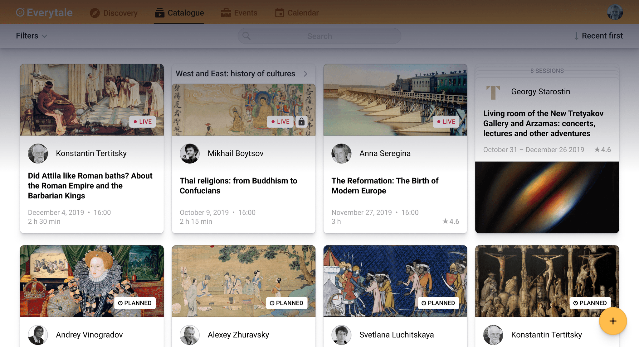
This was the first page that started the whole platform:
Viewers’ version
Streamers’ version
The page stayed unchanged for a few months and allowed:
Backend engineers to significantly improve the core tech
The frontend engineer to draft the next pages
Me to test the streaming functionality on real hardware
Me to start collecting user feedback, which was far more reliable than feedback on mockups
Me to think through and draft the rest of the platform
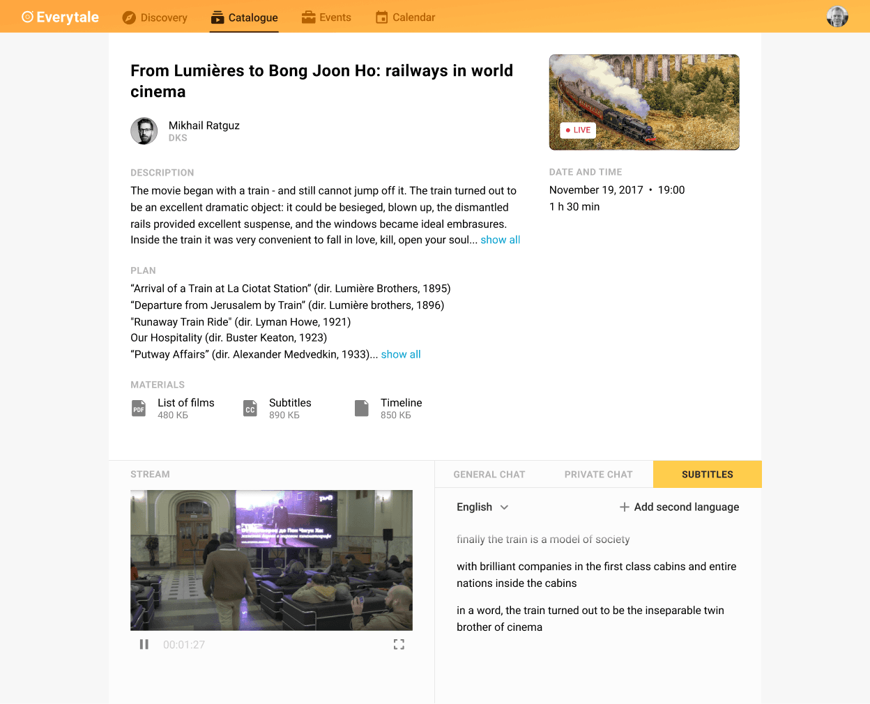
1.3. Signature element
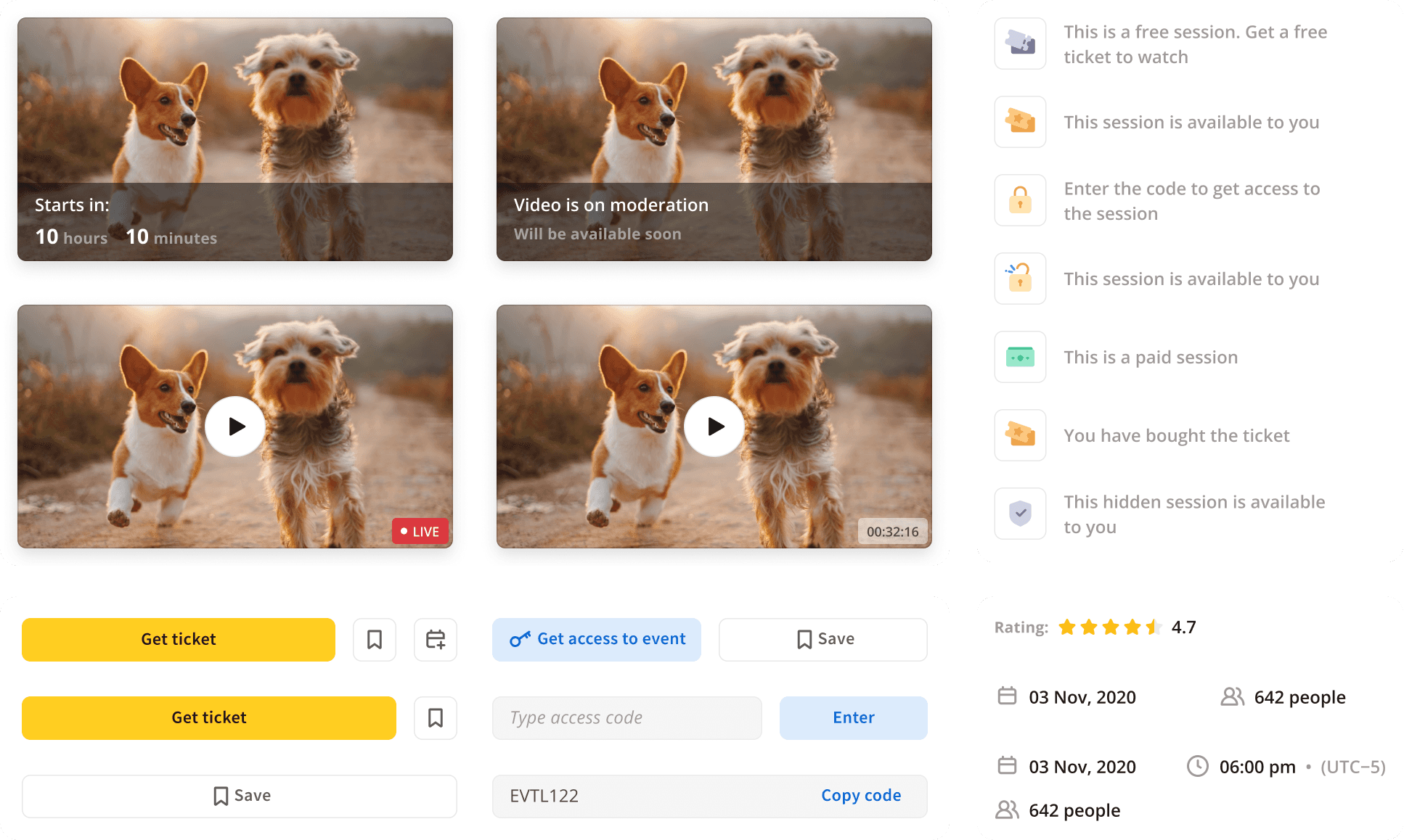
This interface component started as a simple place for extra information, but I saw a lot of potential in it.
First, I made it sticky, so it was always visible on the page. Then I added viewing, payment, and event access functionality. It got a unique look, and even its own name: "Ticket".
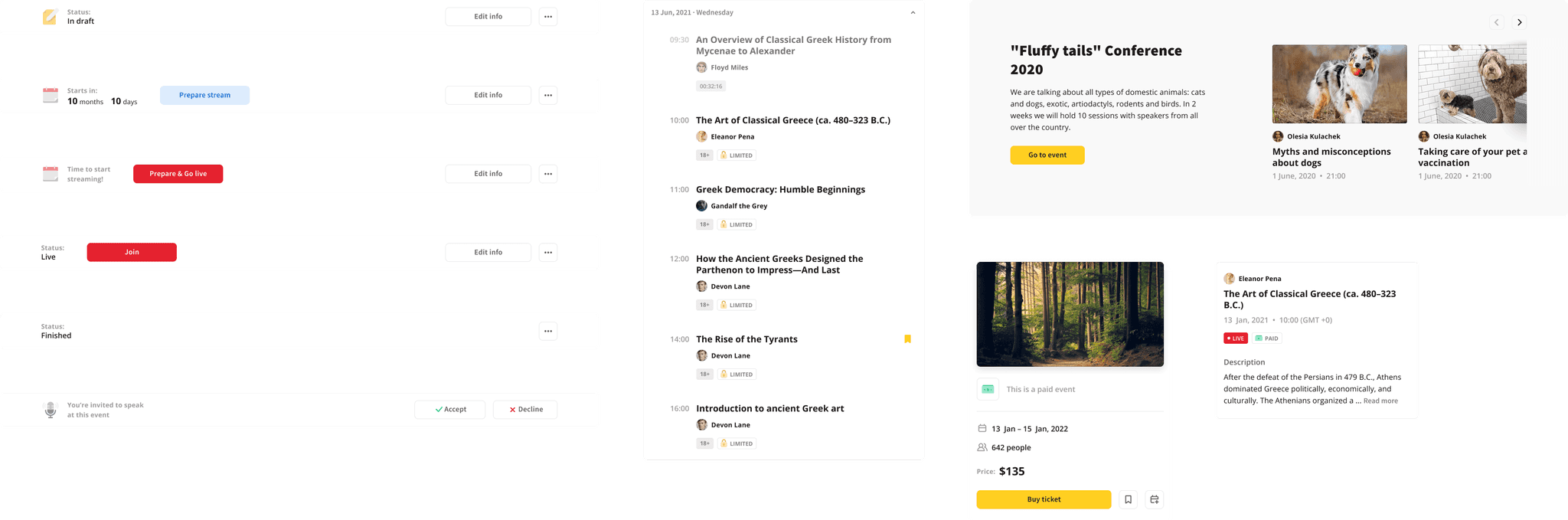
Pretty quickly, the ticket became the most important, signature element of the product:
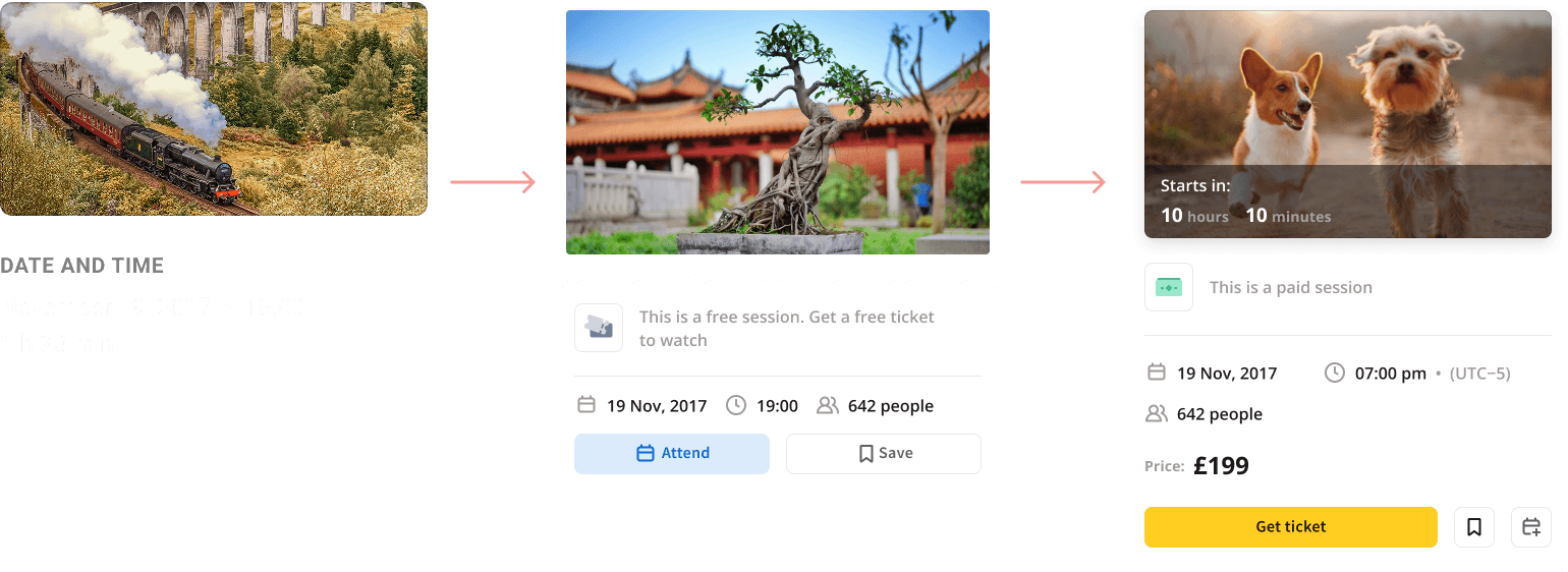
Tickets were modular and depended on the event’s access type and current state, as well as the user’s role and previous actions.
1.4. Screen multiplication
Now it was time to move many functions out of the universal page, so I split it into multiple pages.
Editing functionality was first separated into one screen and later into two:
Session creation
Event creation
The initial screen evolved into two a bit later:
Session information
Event information
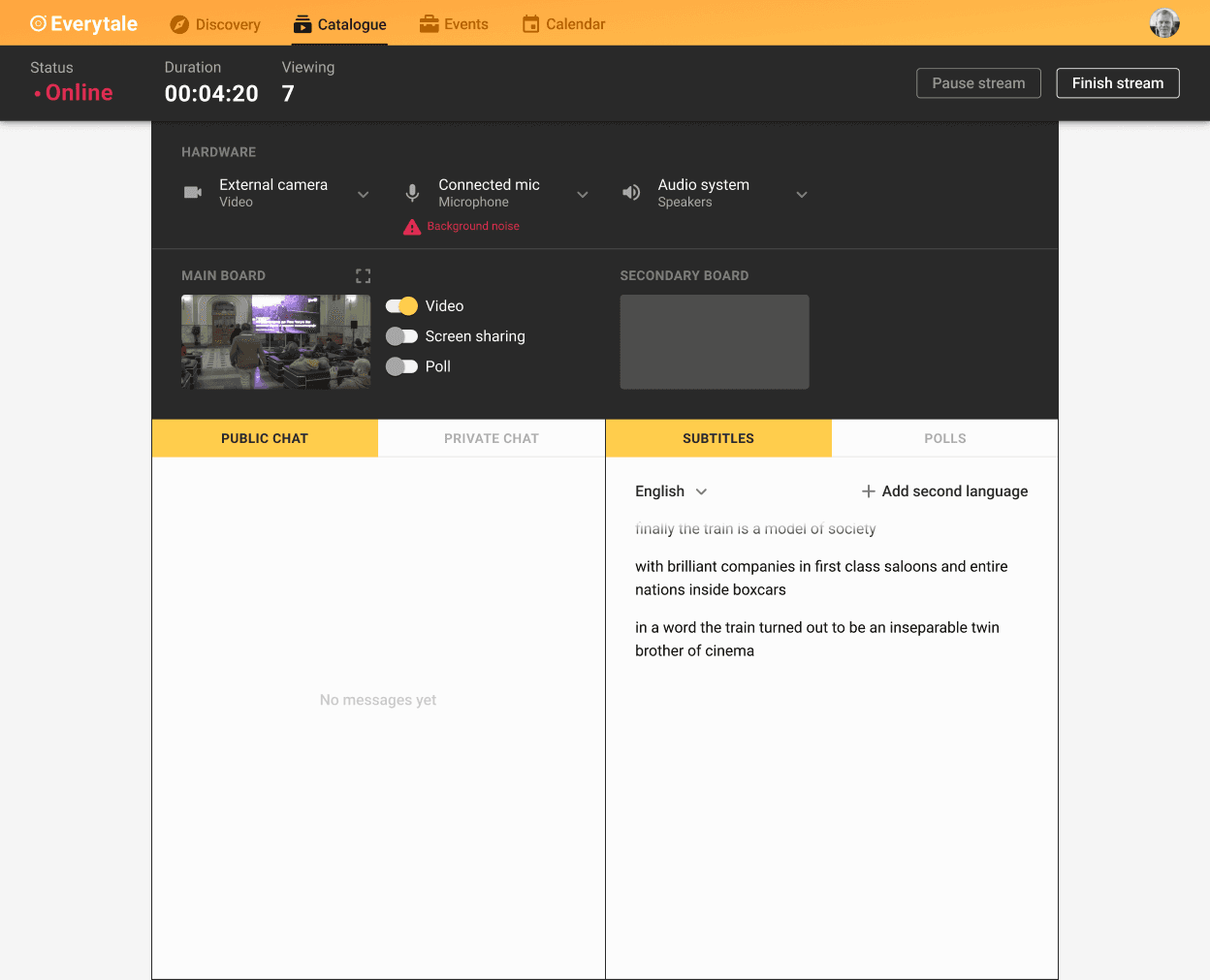
Streaming was separated into three screens:
Session preparation
Session streaming
Session viewing
The first versions of these pages reflected users’ needs well, only because the initial page allowed me to collect a lot of information.
1.5. Exploration stage results
The Exploration stage was quite successful. All initial goals were achieved:
All core functionality was designed and tested
Tons of feedback, insights, and improvement ideas were collected
Engineers stabilized the backend
Moreover, the stage highlighted critical issues that would have created huge problems if discovered later:
Customer development showed that the product should pivot from an educational platform to a platform for online events
Engineers identified major issues in the frontend code, but thanks to the design principles, the impact was minimized
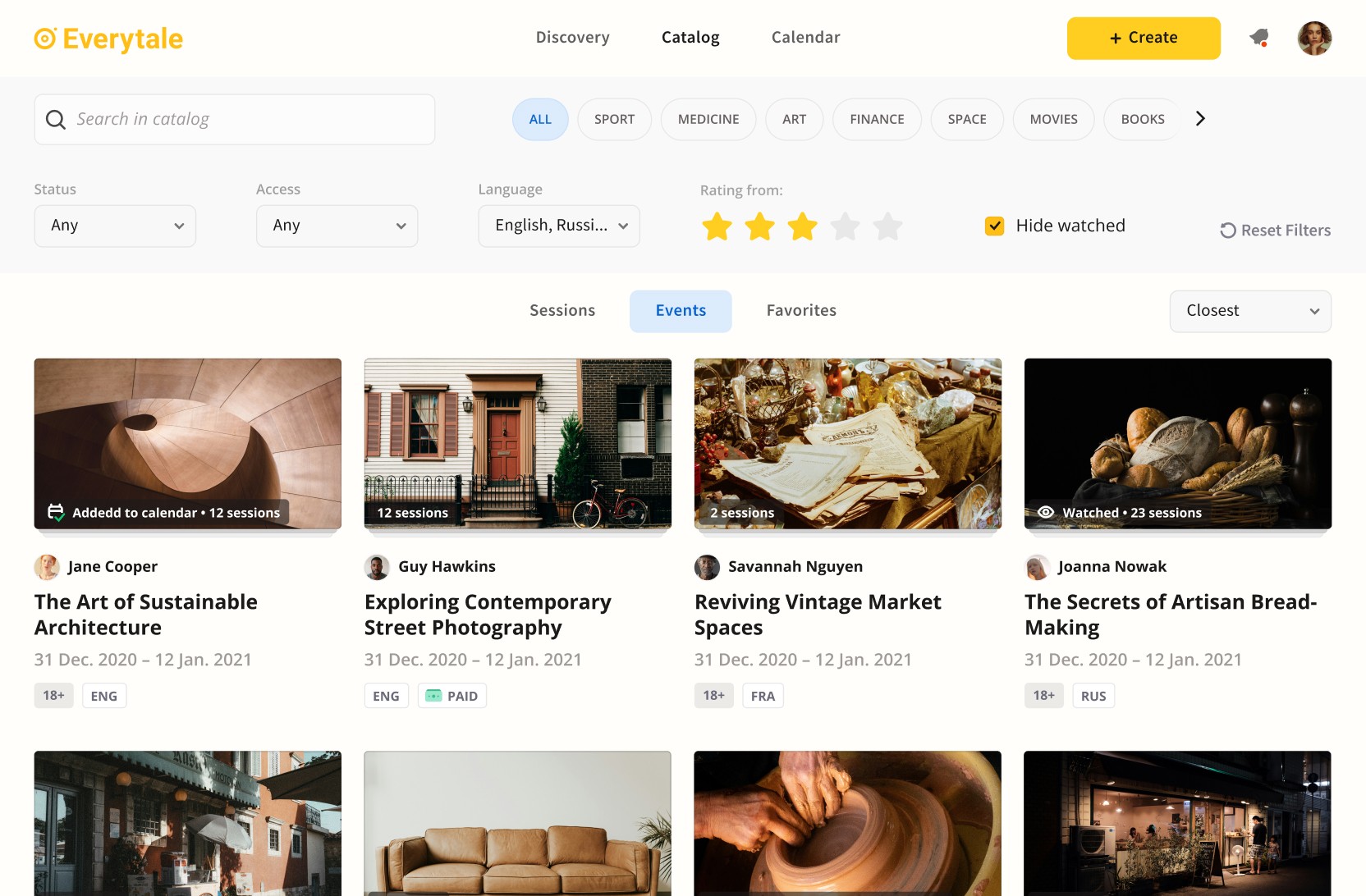
Stage 2. Improvement
2.1. Adaptive design principles
At this stage, I set a new goal for myself and the team: to raise the quality bar and bring the interface to a world-class level. It was time to update the design principles:
Speed over perfection >>> Quality over speed
Rapid iterations over meticulous planning >>> Meticulous planning over rapid iteration
Clarity over minimalism
Unification over customization >>> Customization over unification
Changing the design principles didn’t mean a redesign (quality was always important to me). It meant shifting the team’s focus.
2.2. Exponential complications
At the start, the interface configuration depended only on who was using it (a viewer or a lecturer). Over time, many more independent factors started to influence the interface.
Two roles grew to much more:
Viewer
Administrator
Organizer
Host
Speaker
Temporary speaker
Moderator
In addition to multiple roles, many interface blocks behaved differently depending on their state. Every event went through several states:
Created
Planned
Online
Finished
Uploaded
Events also had different access levels:
Open
Available by code
Hidden (available by direct link)
Paid
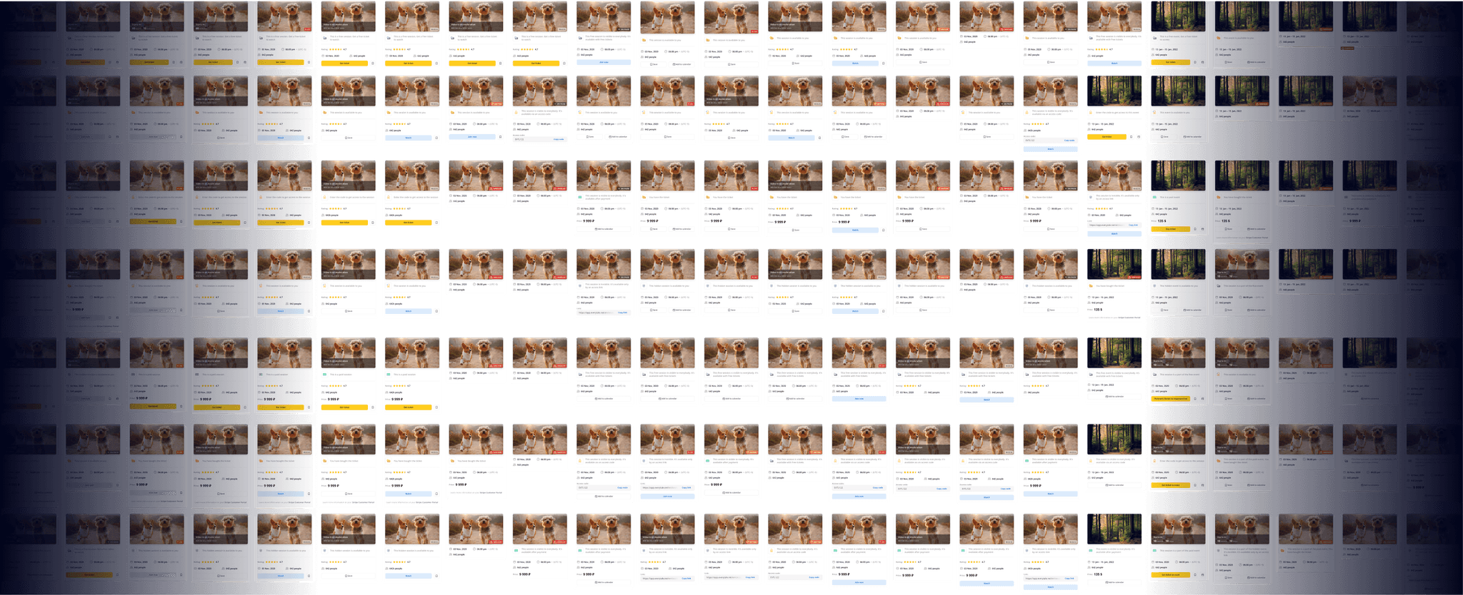
The combination of roles, states, and access types created a huge number of interface variations. I used a few approaches to manage this complexity: progressive disclosure, smart defaults, and panelized interface.
2.3. Progressive disclosure & smart defaults
While working on every piece of the interface, I always asked myself, “Is there anything here I can hide from the default flow?” This approach hid entire workflows from people who didn’t need them.
Another trick was building flows so that, in most cases, everything worked with default values.
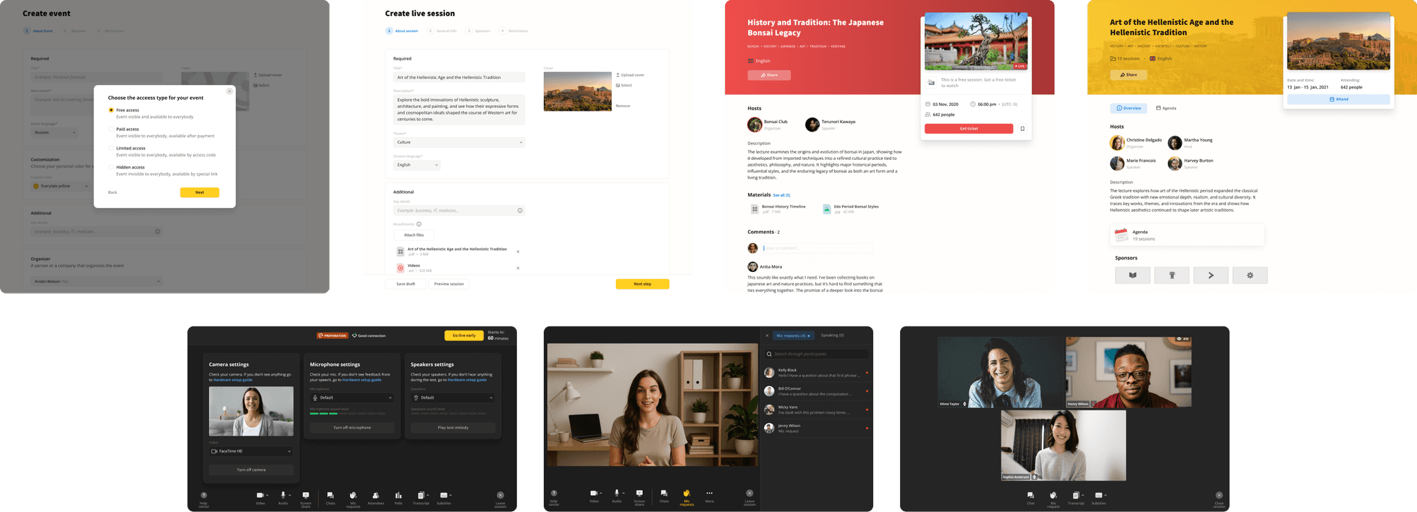
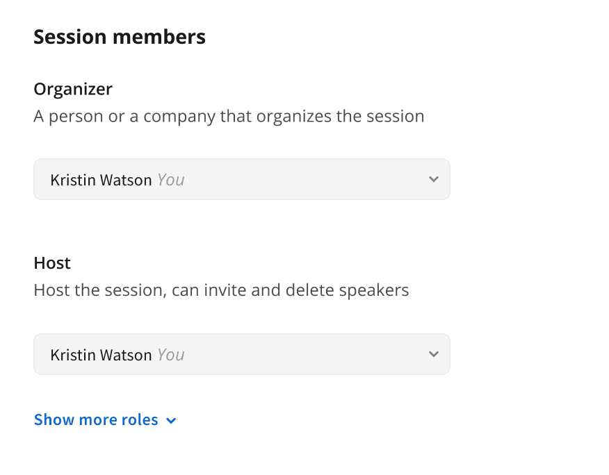
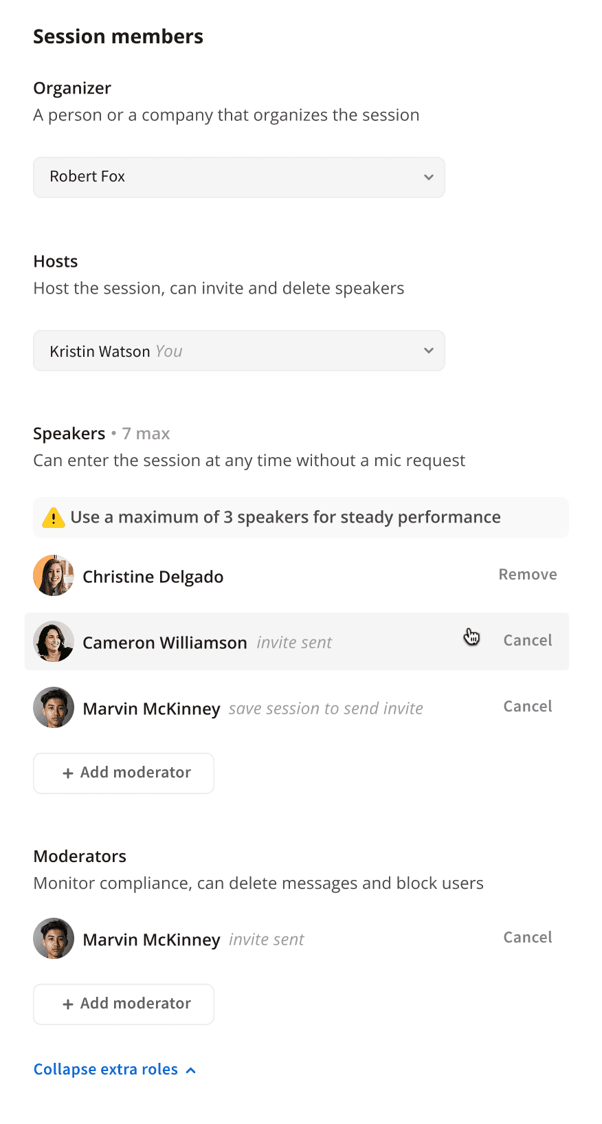
Here is a part of the event creation interface:
The default state is simple and can be completely skipped
Extended functionality with invitation flow and role management
2.4. Panelized interface
Progressive disclosure and smart defaults weren’t enough on their own for such a complex interface, so I divided the platform’s UI into two layers:
Panel layer (small blocks whose content changes constantly)
Base layer (stable content that rarely changes and doesn’t depend on roles, states, or access)
This approach let me split the interface into logical pieces, making it easier for users to understand, designers to work with, and engineers to implement.
2.5. Improvement stage results
A set of experimental features at the start grew into a product launched in Russia, Germany, and the US, with thousands of users and Amazon among our clients.