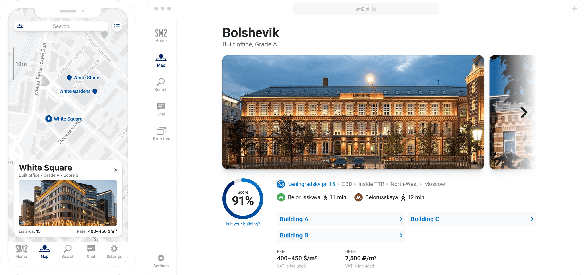
Visualizing a data maze
Building interface to large structures of interconnected data
My objective was to design a new product that would allow access to a wide variety of commercial real estate data.
Stranding in darkness
I started by learning how it works by reading articles, talking to industry professionals, and checking existing services.
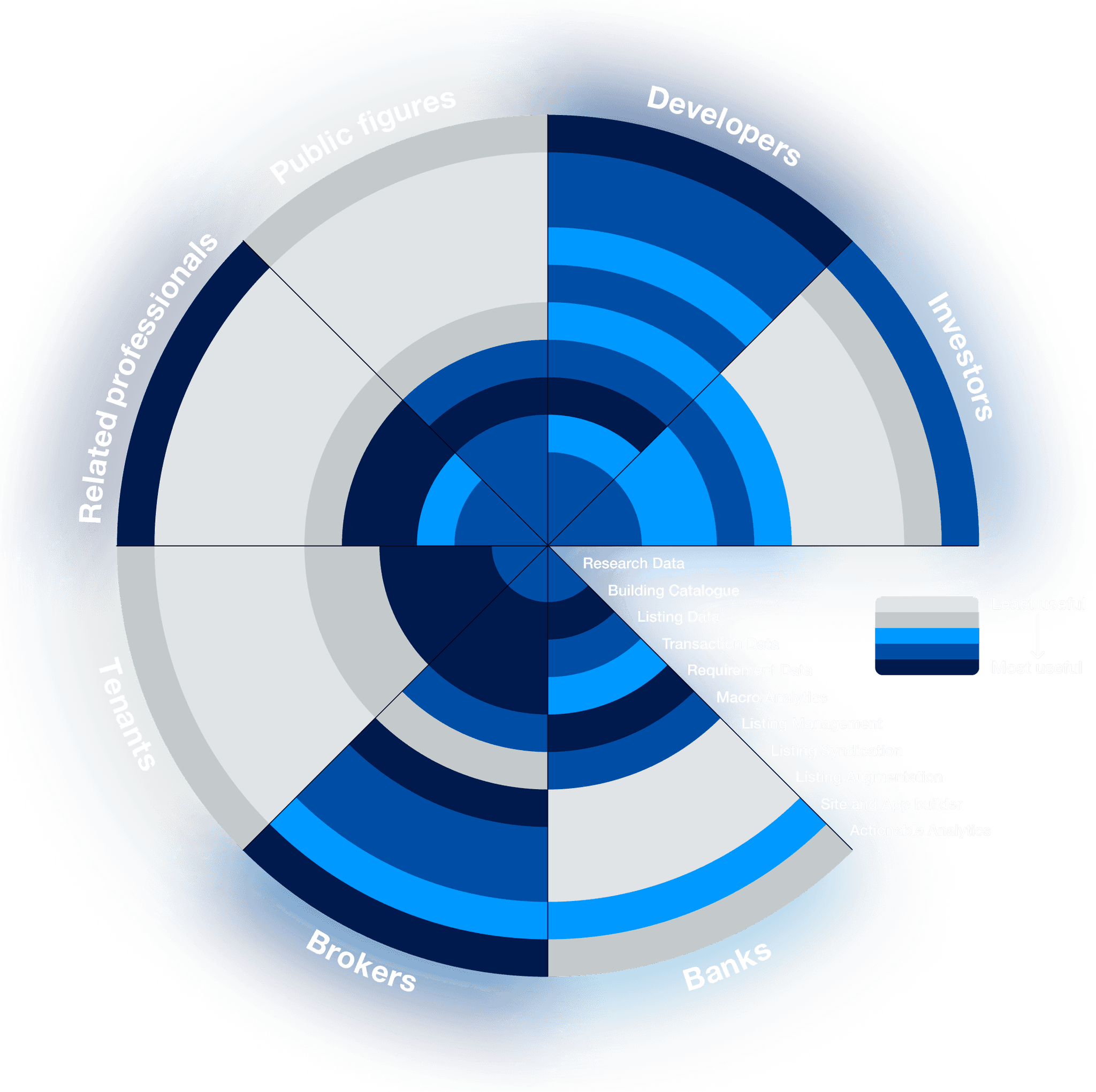
Among our potential users were everybody who was somehow connected to the commercial real estate market. Creating a service from scratch for such a wide range of users is impossible. So, after a series of interviews, I made a diagram of the service's usefulness for different categories.
This way, the primary audience was narrowed to two categories: brokers and developers.
The service was supposed to be used all over the world in the future, so I studied ~50 similar products from global and regional countries from all over the world.

It was crystal clear that the only way to design a system we needed was to use iterative wireframing for as long as possible.
Wireframes, more wireframes, and much more wireframes
The first steps of building a new product are the hardest because there is no base, nothing to test or improve, just a blank paper list.
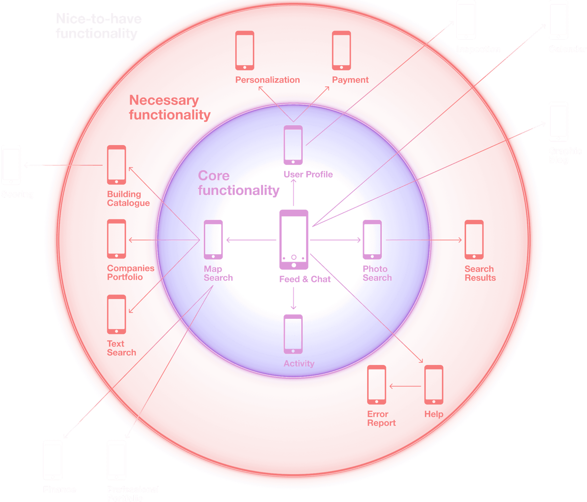
I started from a birds-eye view of the product. The starting point became Snapchat-inspired swipe navigation.
After a few iterations, I've got the starting point.
The next step was to get a rough understanding of the content of the main screens. I made a simple template and described all the screens using it.
Then, I iterated them with the CEO and the whole team to get feedback, generate more ideas, and synchronize.
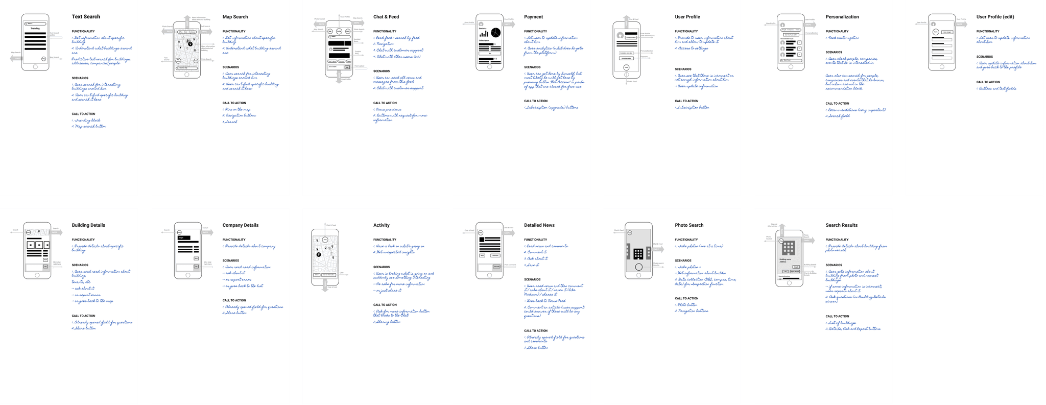
The screen description template was perfect for discussing every screen separately. However, to discuss the whole app, I updated it and printed it on paper (it took six A3 lists).
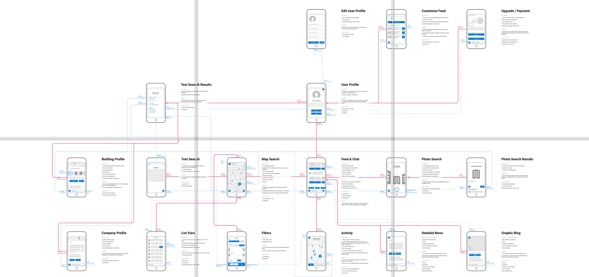
To make the system work, we needed not a single product but a data collection ecosystem. So, after the wireframes of the main product were finished, I switched to the other products: a website builder, an app builder, and a listing management system.
To understand the complexity of such an ecosystem, imagine that there were 8 different entry points into the ecosystem.

Until this point, wireframes were abstract and based on a general understanding of the system. It was still too early to work on UI.
Prototyping
After discussing static wireframes, I had enough information to start building prototypes.
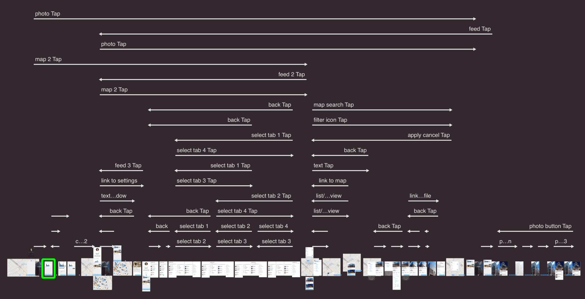
Tests showed that the swipe-based navigation royally failed, so I created a second, more conventional version.
Navigation v2
Real estate data was highly fragmented. That's why data interconnection was one of the system's most essential features.
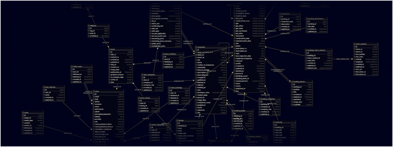
The system had many interconnected nodes and a few entry points (news feed, map, text search). Users were supposed to surf through data seamlessly without needing to return to the point where they started. The standard iOS navigation with "hyperlinks" seemed perfect for this case.
What I didn't know (Apple didn't mention it in design guidelines) is that this approach doesn't match the concept of app tabs (tabs are supposed to be completely independent).
To fix this problem, I modified the tabs' behavior.
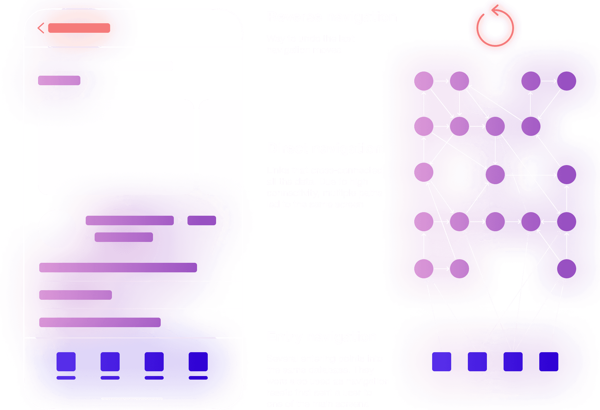
Despite the complex look, navigation worked perfectly well.
Building production interfaces
Finally, it was time to convert wireframes into the first version of the interface. Thanks to many weeks of wireframing, testing, and discussions, the team saved a lot of time.
