Minor changes with major consequences
A path of constant changes that changed a product and a company
When I joined the PortfolioPilot team, my initial objective was to build new features and improve existing ones.
I was the sole designer, guiding the platform and responsible for all design decisions.
Soon after joining, I saw I needed a second workstream to fix processes and address fundamental product issues:
Primary track: follows the backlog, high priority, quick results.
Secondary track: driven by my assessment of what needs improvement, done in spare cycles, longer-term outcomes.
What I tackled at the secondary track:
" transform="translate(4.15 5.255)" width="16.100010317993164px"/><path d="M 0 2.75 C 0 1.231 1.231 0 2.75 0 C 4.269 0 5.5 1.231 5.5 2.75 C 5.5 4.269 4.269 5.5 2.75 5.5 C 1.231 5.5 0 4.269 0 2.75 Z" fill="transparent" height="5.5px" id="trPH3ttBV" stroke-dasharray="" stroke-linecap="round" stroke-linejoin="round" stroke-width="1.5" stroke="rgb(242, 110, 126)" transform="translate(9.25 2.5)" width="5.5px"/><path d="M 1.375 0.369 C 2.69 -0.39 4.372 0.06 5.131 1.375 C 5.89 2.69 5.44 4.372 4.125 5.131 C 2.81 5.89 1.128 5.44 0.369 4.125 C -0.39 2.81 0.06 1.128 1.375 0.369 Z" fill="transparent" height="5.500005332215013px" id="KmJ4Q_r1Y" stroke-dasharray="" stroke-linecap="round" stroke-linejoin="round" stroke-width="1.5" stroke="rgb(242, 110, 126)" transform="translate(2.32 14.5)" width="5.499996559037108px"/><path d="M 1.375 5.131 C 0.06 4.372 -0.39 2.69 0.369 1.375 C 1.128 0.06 2.81 -0.39 4.125 0.369 C 5.44 1.128 5.89 2.81 5.131 4.125 C 4.372 5.44 2.69 5.89 1.375 5.131 Z" fill="transparent" height="5.500005332215018px" id="GmEGWSsQg" stroke-dasharray="" stroke-linecap="round" stroke-linejoin="round" stroke-width="1.5" stroke="rgb(242, 110, 126)" transform="translate(16.172 14.5)" width="5.499994211112163px"/></svg>)
" height="5.9999975px" id="I1g1BWJiQ" transform="translate(9 6)" width="5.999997499999999px"/><path d="M 2.431 15.5 C 4.122 13.656 6.551 12.5 9.25 12.5 C 11.949 12.5 14.378 13.656 16.069 15.5 M 2.431 15.5 C 4.122 17.344 6.551 18.5 9.25 18.5 C 11.949 18.5 14.378 17.344 16.069 15.5 M 2.431 15.5 C 0.921 13.854 0 11.659 0 9.25 C 0 4.141 4.141 0 9.25 0 C 14.359 0 18.5 4.141 18.5 9.25 C 18.5 11.659 17.579 13.854 16.069 15.5" fill="transparent" height="18.5px" id="ZMBceKfRf" stroke-dasharray="" stroke-linecap="butt" stroke-linejoin="miter" stroke-miterlimit="10" stroke-width="1.5" stroke="rgb(242, 110, 126)" transform="translate(2.75 2.75)" width="18.5px"/></svg>)
" transform="translate(1.479 10.995)" width="5.847939984122817px"/><path d="M 5.217 0 L 1.317 1.42 C 0.279 1.797 -0.257 2.945 0.121 3.983 L 0.933 6.215 C 1.311 7.253 2.459 7.788 3.497 7.41 L 7.397 5.991" fill="transparent" height="7.531343321407497px" id="kaKLdkNmV" stroke-dasharray="" stroke-linecap="round" stroke-linejoin="round" stroke-width="1.5" stroke="rgb(242, 110, 126)" transform="translate(6.07 7.893)" width="7.397286910554188px"/><path d="M 1.646 2.3 L 7.966 0 L 10.873 7.987 L 4.553 10.288 C 3.255 10.76 1.821 10.091 1.348 8.794 L 0.151 5.505 C -0.321 4.207 0.348 2.773 1.646 2.3 Z" fill="transparent" height="10.439301171800688px" id="QhdLNaS0Y" stroke-dasharray="" stroke-linecap="round" stroke-linejoin="round" stroke-width="1.5" stroke="rgb(242, 110, 126)" transform="translate(11.628 3.738)" width="10.873280142231453px"/><path d="M 0 5.5 L 0 0" fill="transparent" height="5.5px" id="ooOL3Qh9W" stroke-dasharray="" stroke-linecap="butt" stroke-linejoin="miter" stroke-miterlimit="10" stroke-width="1.5" stroke="rgb(242, 110, 126)" transform="translate(10.75 14.75)" width="1px"/><path d="M 0 0 L 6 0" fill="transparent" height="1px" id="gs8ShJcNX" stroke-dasharray="" stroke-linecap="round" stroke-linejoin="miter" stroke-miterlimit="10" stroke-width="1.5" stroke="rgb(242, 110, 126)" transform="translate(7.75 20.25)" width="6px"/></svg>)
" transform="translate(2.715 3.75)" width="17.53555679321289px"/><path d="M 0 0 L 8.996 0" fill="transparent" height="1px" id="lZKkMTAWs" stroke-dasharray="" stroke-linecap="round" stroke-linejoin="round" stroke-width="1.5" stroke="rgb(242, 110, 126)" transform="translate(6.738 12.75)" width="8.996120000000001px"/><path d="M 1.5 0.75 C 1.5 1.164 1.164 1.5 0.75 1.5 C 0.336 1.5 0 1.164 0 0.75 C 0 0.336 0.336 0 0.75 0 C 1.164 0 1.5 0.336 1.5 0.75 Z" fill="transparent" height="1.5px" id="rDZOZaWyM" stroke-dasharray="" stroke-linecap="round" stroke-linejoin="round" stroke-width="1.5" stroke="rgb(242, 110, 126)" transform="translate(17.75 1.75)" width="1.5px"/><path d="M 0.25 0.5 C 0.388 0.5 0.5 0.388 0.5 0.25 C 0.5 0.112 0.388 0 0.25 0 C 0.112 0 0 0.112 0 0.25 C 0 0.388 0.112 0.5 0.25 0.5 Z" fill="transparent" height="1px" id="HjRUr7bFE" stroke-dasharray="" stroke-linecap="round" stroke-linejoin="round" stroke-width="1.5" stroke="rgb(242, 110, 126)" transform="translate(19.75 5.75)" width="1px"/><path d="M 0 0.01 L 0 0" fill="transparent" height="1px" id="Du_vMvdNK" stroke-dasharray="" stroke-linecap="round" stroke-linejoin="round" stroke-width="1.5" stroke="rgb(242, 110, 126)" transform="translate(20 5.99)" width="1px"/></svg>)
" transform="translate(7.75 15)" width="8.5px"/><path d="M 14.5 7.25 C 14.5 11.254 11.254 14.5 7.25 14.5 C 3.246 14.5 0 11.254 0 7.25 C 0 3.246 3.246 0 7.25 0 C 11.254 0 14.5 3.246 14.5 7.25 Z" fill="transparent" height="14.5px" id="j6ZlHzFlW" stroke-dasharray="" stroke-linecap="round" stroke-linejoin="round" stroke-width="1.5" stroke="rgb(242, 110, 126)" transform="translate(4.75 1.75)" width="14.5px"/></svg>)
Turning chaos into a system
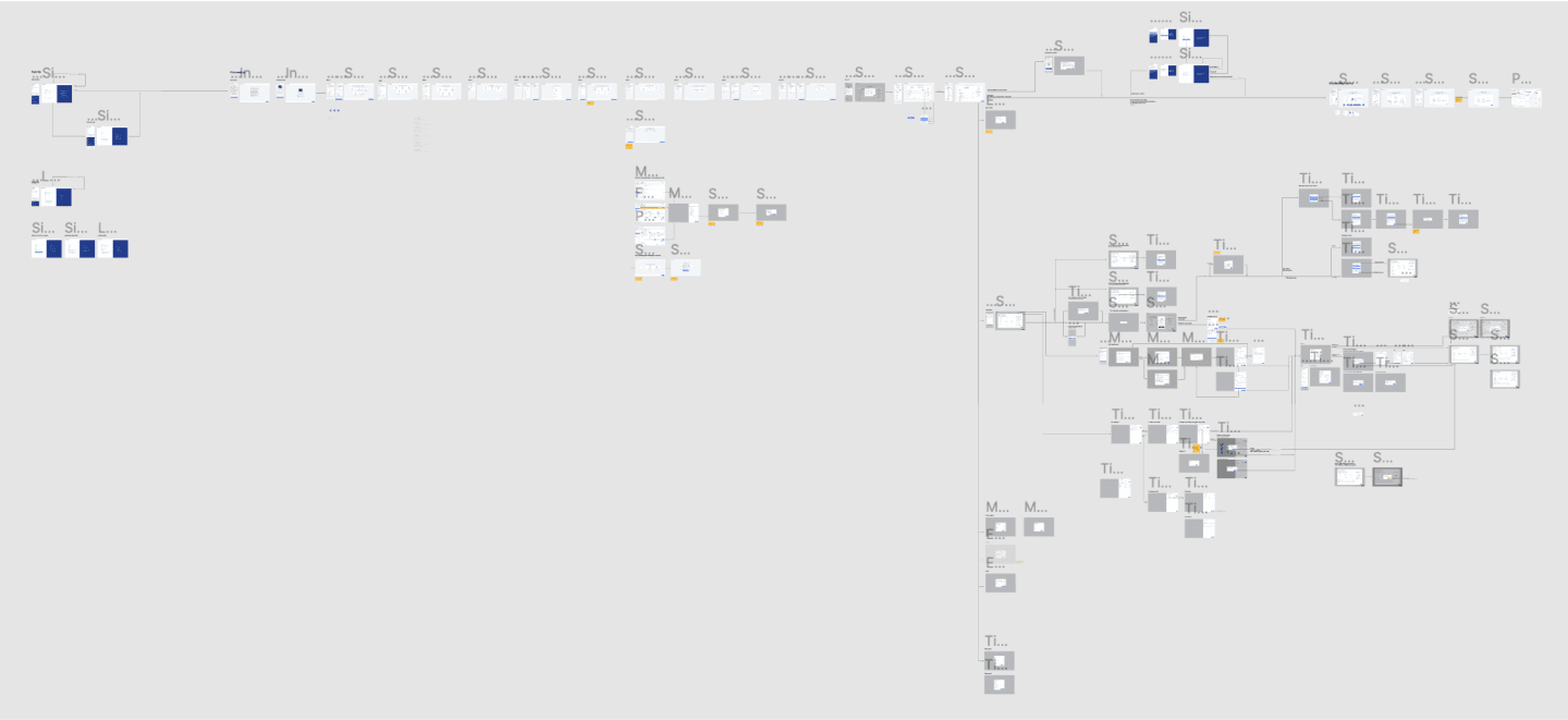
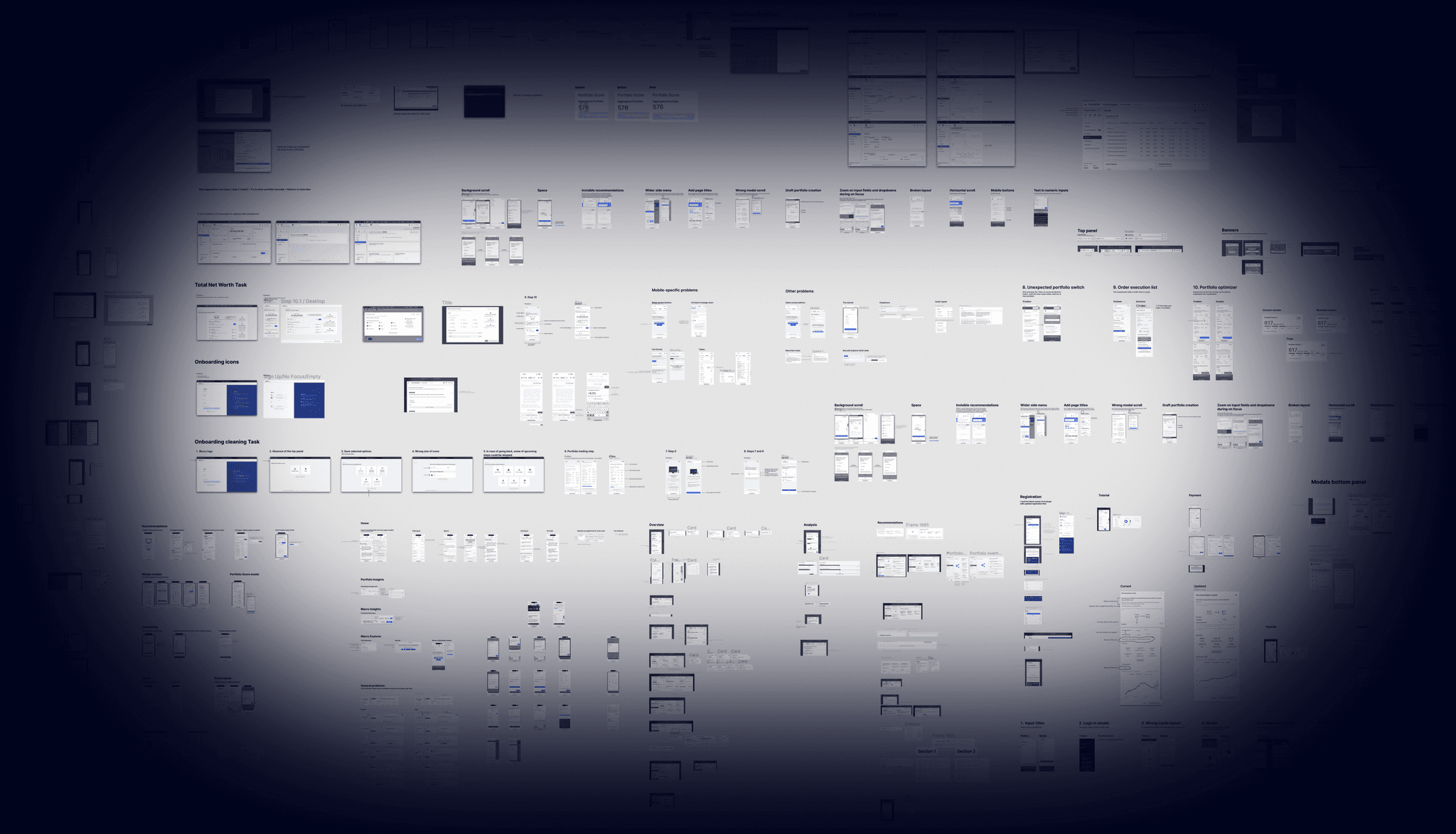
The first challenge was to structure mockups.
All mockups were in complete disarray. Some were grouped, and some weren't. Many features had several versions that needed to be sorted by which was the latest and whether it was implemented. Also, mockups were mixed with drafts.
Meanwhile, the product wasn't stabilized and changed (sometimes significantly) every week (typical for an early-stage startup).
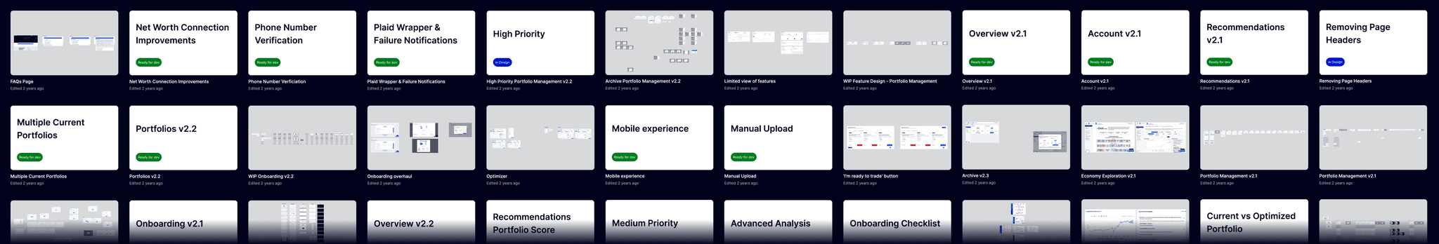
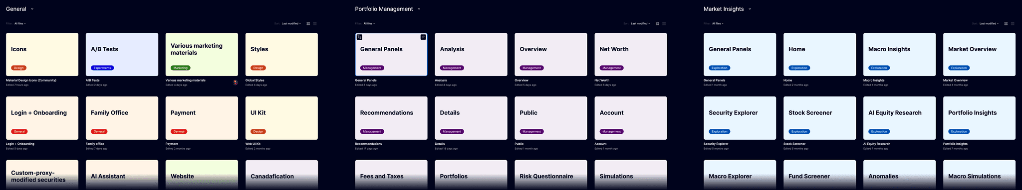
I started by checking all mockups, comparing different versions, and reviewing the current implementation. I created a few projects:
Two projects for both major parts of the system
General project for all-system features
Sandboxes for personal experiments
Archive
The next step was to clean the mockup structure inside the files. Tile mockup organization created a lot of problems:
It's hard to read (every time you need to compare neighbor mockups to spot differences)
It tells nothing about user-flows
It's impossible to maintain (every change would trigger changes in multiple mockups)
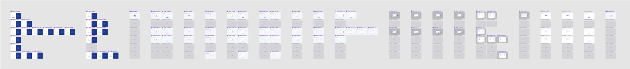
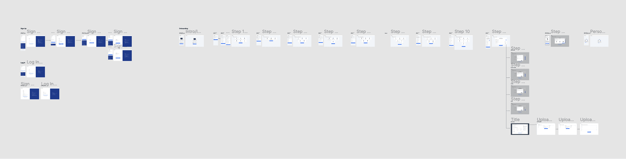
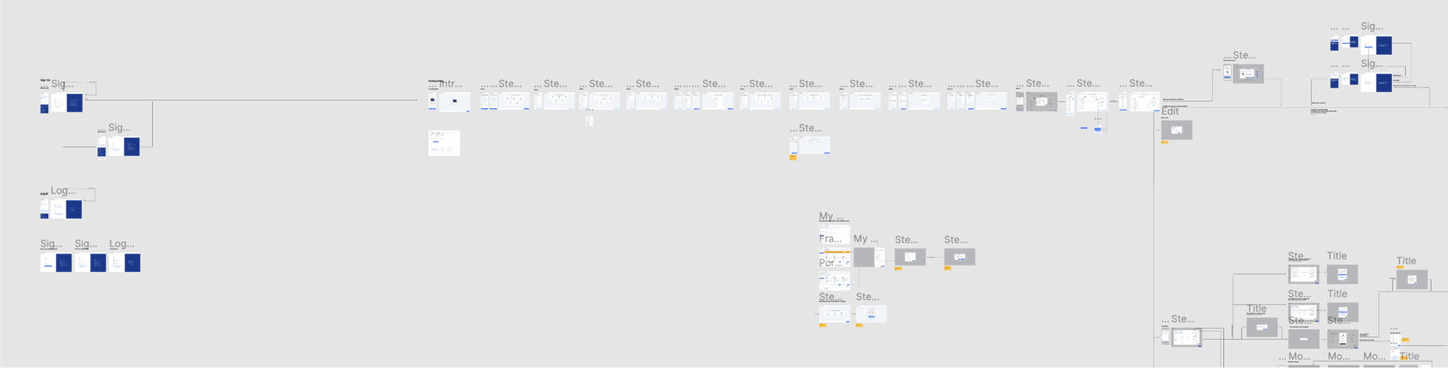
I got rid of useless duplications and arranged mockups into flows. This allowed me to easily visualize even the most complicated logic.
The next step was to clean the production interface.
Designing design principles
After organizing all files and getting a bird’s-eye view of the product, it was time to define design principles. They have to be a bit controversial; otherwise they don’t simplify decision making.
Design principles:
Reuse over creation
Simplicity over transparency
Rapid iteration over planning
An example of how I applied them to update the registration flow:
Reuse over creation. I used existing components.
Tradeoff: the result wasn’t as visually polished as I prefer.
Outcome: easy to implement and ship.
Simplicity over transparency. I reduced verification friction.
Tradeoff: the flow felt less predictable when some users were blocked until email verification.
Outcome: many users bypassed verification and kept moving.
Rapid iteration over meticulous planning. I shipped early and iterated.
Tradeoff: the optimal flow wasn’t in the first release.
Outcome: fast learning and room to prove the idea.
Read more details about this case in the next chapter.
Shifting the team’s perspective
Sometimes what's obvious to a designer isn’t obvious to other stakeholders. The registration flow was one of those cases where I had to shift the team's view.
One of the first things I mentioned after trying PortfolioPilot for the first time was phone verification. It turned out that there were two reasons for having it:
Filter out people outside North America.
Protect the system from data scrapers.
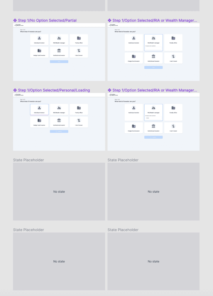
Registration flow initial look

What I saw instead:
Letting anyone in cost us nothing, but the filter created a strong barrier for real users.
The scraping threat was theoretical and could be handled with simple monitoring. And our onboarding was complex enough to be a serious hurdle for automation anyway.
My explanation didn’t land, so I decided to move in the right direction step by step.
Step 1: Obvious win.

I added Google sign-in so some users could skip name and password.
Step 2: Alternate verification.

I offered a choice: phone or email verification. The goal was to test whether scraping was a real risk.
Step 3: Remove phone verification.

Data showed email was sufficient, so I eliminated phone verification.
Step 4: Verification via intermediaries.

I noticed that many users link their bank accounts during onboarding, which is a strong form of verification. So, I excluded them from additional verification.
To implement this, I moved verification after onboarding.
The solution was even more successful since people who reached verification have already committed time and effort and were more eager to continue.
As a result of simplifying the registration flow, the activation rate increased from 19% to 65%. While other changes in the registration flow were also implemented, the main improvement happened after verification rethinking at step 4.
Moving from ship-and-see to test-and-learn
After I started working at the company, I found out there was no testing culture in the company. Everything was just pushed into production. It’s not uncommon for startups and has logical reasons. That said, I still thought prototypes and tests are irreplaceable in the design process.
I had to persuade stakeholders to start using them. I made a few attempts, but it didn’t work, so I decided to change my approach and show rather than tell.
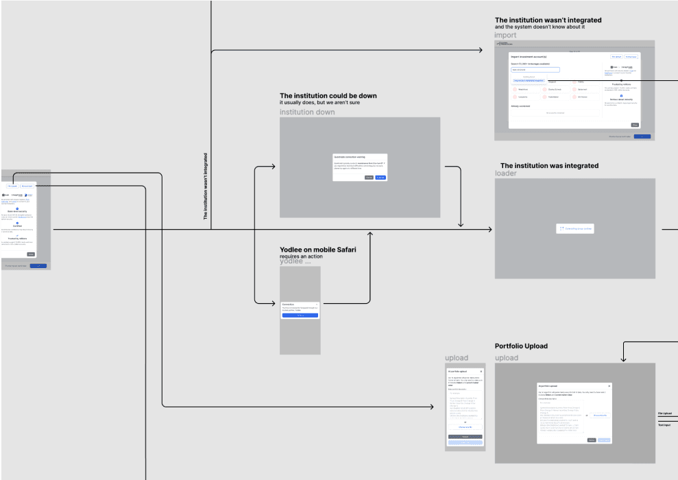
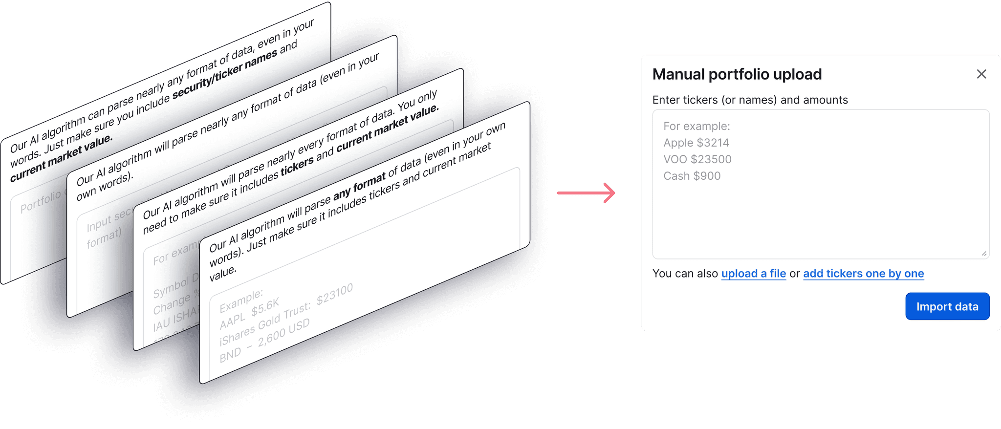
I waited for some time for the right task, and finally it appeared: parsing an investment portfolio using an LLM.
The functionality was completely new, so I created an interactive prototype in Figma and presented it to the founder. He was so inspired by the prototype that he not only agreed to the idea but also suggested testing it as a standalone functionality.
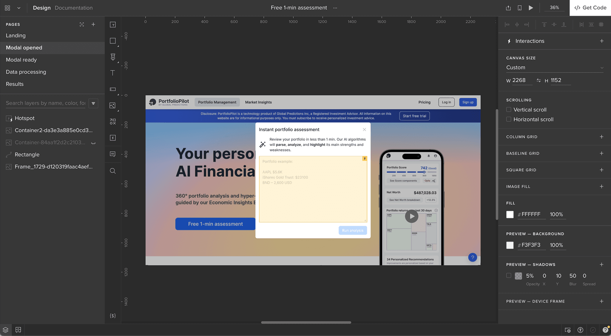
It took me seven iterations to find the right configuration of the modal that was clear to people.
I finally found the working configuration, but the main victory was the successful integration of prototypes and tests into our company workflow. A year later, our small team was constantly parallel running about 30 different A/B tests.
Raising the quality bar
Almost everything was misaligned at the start, with wrong gaps, too many styles, wrong accents, and a lack of visual hierarchy. Meanwhile, it wasn't possible to fix everything straight away because:
Too many small imperfections
Every week, some part(s) of the system changed (there is no point in fixing something that will be changed soon anyway)
The primary focus was on adding new or updating existing functionality
In other words, this cleaning was a long-lasting background process.
Every issue I created had a hidden purpose. I added an explanation to every problem we fixed. Meanwhile, understanding how not to do is one of the learning techniques. In other words, through explaining myself, I was also training engineers in design.
I created many cleaning tasks, but despite looking chaotic, all of them were carefully prioritized. I started with the most influential issues and moved to the least influential. Every issue was evaluated and sent to the backlog according to its importance.

Although I didn't like UI components, I knew it was too early for a proper redesign, so I made just a few minor changes to the UI kit.
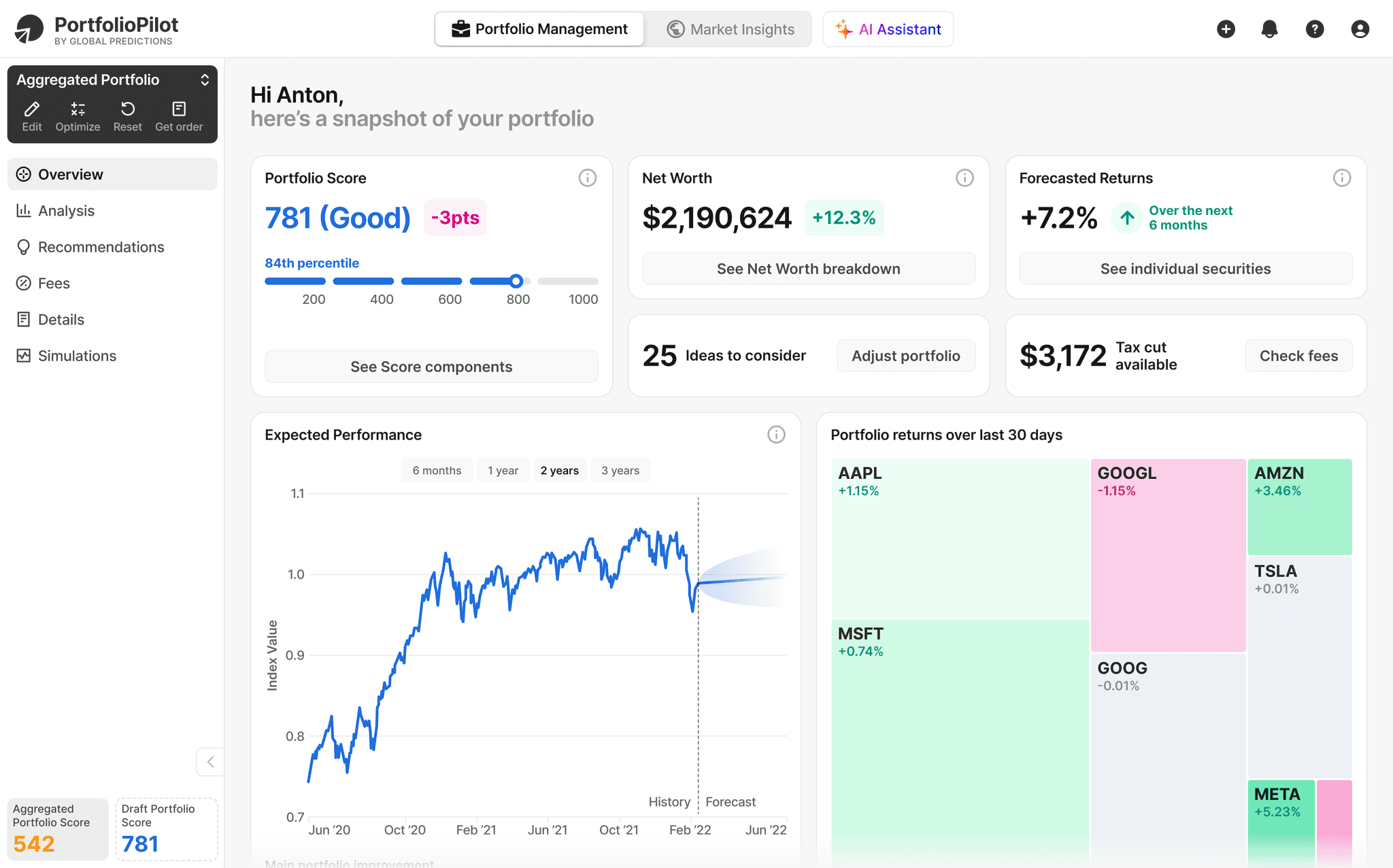
When I started, the main screen of the system looked like this:
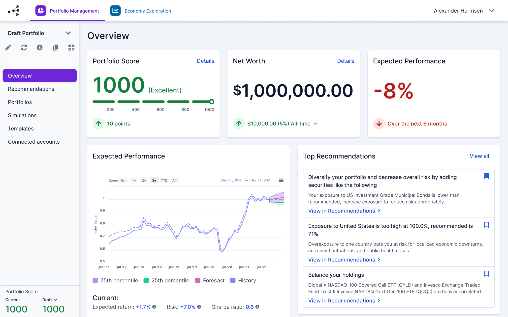
When I left, it transformed into this:
Results
As a result of my work, the platform evolved from “raw, unfinished, and experimental” to “professional and reliable,” in the words of its users. That shift allowed us to integrate payments and start generating revenue.
I delivered beyond design: I set up design processes, introduced the most useful practices, and helped shift the team’s perception of the product.